十六、Svg 详细版
一)基础篇
(一)概述
SVG,Scalable Vector Graphics,可缩放的矢量图形
1.图形和图像
- 图形:是由 被称为矢量的数学对象 所定义点、线、面等所描绘而成
- 图像:又称为栅格图、点阵图、位图或像素图,用像素描述图像中每一个点颜色和亮度等信息
2.svg特点
- svg使用xml绘制图形(canvas绘制图形)
- 可以使用文本编辑器创建和修改图形
- 因为是描述的图形,浏览器会根据描述来绘制图形,而不是使用像素填充空间,所以svg 适合不同大小的屏幕
- 因为是xml语言描述的图形,图形中的部分都是由标签组成,其中 每一个标签都可以使用javascript和css控制与交互
- svg提供了强大的滤镜功能,可以绘制更逼真、更复杂的图形效果
2003成为w3c标准,目前绝大多数的浏览器都支持svg绘图
目前在可视化领域使用非常频繁,svg可以单独使用,也可以和d3、echarts等技术配合应用
也是解决网站图标问题的最佳解决方案
3.svg与canvas绘图的差异
| SVG | Canvas |
|---|---|
| 2003成为w3c标准 | html5新标签 |
| 绘制矢量图 | 绘制位图 |
| 放缩不会导致失真 | 放缩会导致失真 |
| 对(图形)标签进行操作,方便,灵活 | 对像素点进行操作,效果更细腻,不易操作 |
| 交互性强,容易实现动画 | 动画逻辑实现复杂 |
| 存在一定的性能问题 | 性能略高一些 |
| 适合绘制地图、图标等 | 适合绘制图表、制作游戏 |
| 不易绘制3d图形 | 提供了绘制3d图形的api |
(二)svg使用
1.浏览器直接打开
- svg本身是xml语法文件,需要指定渲染规则才可以显示图形效果
<svg xmlns="http://www.w3.org/2000/svg"></svg>
2.嵌入html网页
1) 使用 <img> 引入
- 无法引入源码
- 不能通过css和js操作
<img src="1.svg" />
2)直接嵌入svg源码
3)使用 <iframe> 引入
- 可以通过js操作引入文档内容,从而控制svg效果
<iframe src="1.svg" width="300" height="300" frameborder="0"></iframe>
const frame = document.querySelector("iframe");
frame.onload = function () {
  const childDoc = frame.contentDocument;
  const array = childDoc.querySelectorAll(".st0");
  array.forEach((e) => {
    e.style.fill = "#afc";
  });
};
4)使用 <object> 引入
<object data="1.svg"></object>
注意
- 使用iframe和object引入时,需要注意 同源问题
- 否则无法通过js获得内部document对象
- 实际开发中不推荐优先使用
(三)svg准备
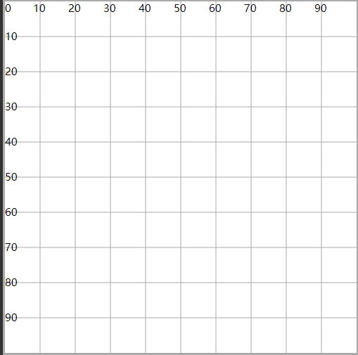
1.坐标系
- 绘制了
100 * 100的坐标系 - 左上角原点
(0,0),向右为x正轴,向下为y正轴 - 这个坐标系对接下来的图形绘制没有任何影响,只是方便观察
2.了解svg根元素
1)svg标签位置
- 写在
.svg文件中- 作为根标记
- 要求 有且只有一个
- 写在
.html文件中- 可以写多个标记,表示嵌入了多个svg图片
- 每一个svg都是一个独立的区域
2)坐标系
- svg中每一个图形的绘制都会基于一个坐标系(系统)
- 隐式
这是真正的坐标系,上面绘制的坐标系只是基于真实坐标系形成的图形,方便理解
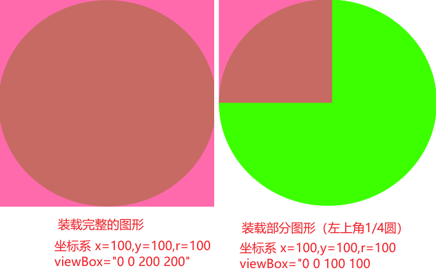
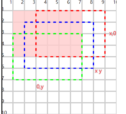
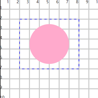
3)viewBox属性
- 视图窗口,装载绘制的图形
- 可以装载整个图形,也可以装载部分图形
- 通过
x、y、width、height四个属性值来控制- x和y设置 窗口起始的位置
- 如果x和y为负,最终的装载的结果相当于图形向右向下
- width和height用来设置 窗口的宽高
- x和y设置 窗口起始的位置
<svg viewBox="0 0 100 100"></svg>
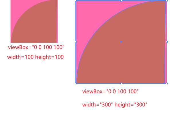
4)width和height属性
- 设置视口区域(可视区域)的大小
- viewBox窗口装载完的图形,需要在视口展示
- 在没有设置viewBox的情况下,viewBox装载的区域和视口区域相同
- 如果设置了viewBox,且装载区域的大小与可视区域的大小不同,此时就会按照比例,对装载区域图形放大或缩小展示
- 可以合理的利用viewBox和width与height实现图形的放缩
相关信息
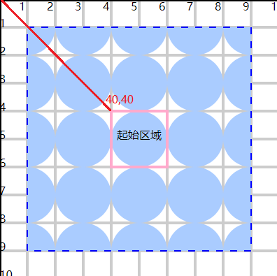
- 通过坐标系,绘制了
(100, 100)r=100 的圆 - 设置窗口装载
(100, 100)范围,装载了1/4的圆,也就是左上角的圆 - 将窗口中这1/4个圆,放到
400*400范围的视口中展示,最终这1/4圆会 放大4倍 展示
3.svg插件
| 插件 | 功能 |
|---|---|
| SVG | 支持标签补全、属性补全等,必须以 < 开始 |
| SVG Snippets | 支持标签名补全标签 |
| SVG Preview | 预览svg效果 |
(四)基本图形
1.矩形
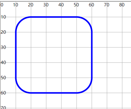
<rect x="10" y="10" width="50" height="50" />
- x、y:坐标系中的起始坐标
- width、height:设置矩形的宽高
相关信息
- 矩形默认有一个黑色的填充(背景色),可以使用
fill和stroke属性设置填充颜色和边框颜色 fill="none"表示没有填充颜色- 所有图形都有
fill和stroke属性
- 使用 rx、ry 设置圆角半径
<rect x="10" y="10" width="50" height="50" fill="none" stroke="blue" rx="10" ry="10" />
2.圆形
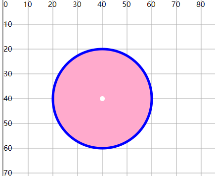
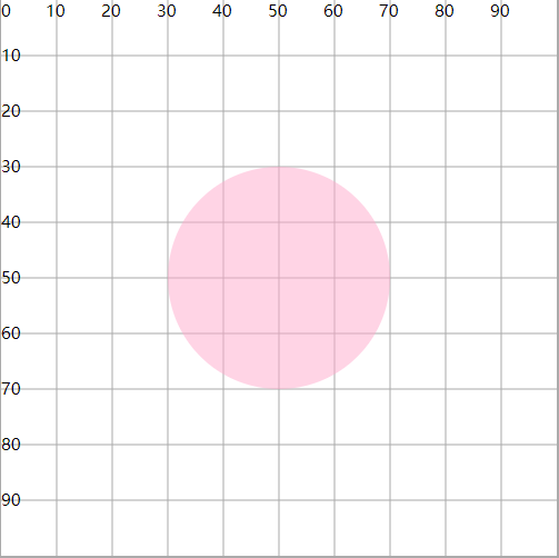
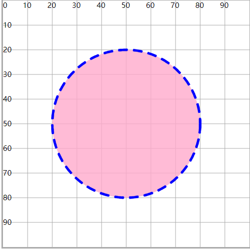
<circle cx="40" cy="40" r="20" fill="#fac" stroke="#00f" />
<circle cx="40" cy="40" r="1" fill="#fff" />
- cx、cy:在坐标系设置原点
- r:设置圆的半径
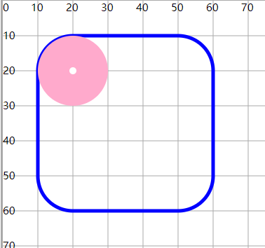
案例:圆形和矩形配合,体现矩形圆角的设置
<rect x="10" y="10" width="50" height="50" fill="none" stroke="#00f" rx="10" ry="10" />
<circle cx="20" cy="20" r="10" fill="#fac" />
<circle cx="20" cy="20" r="1" fill="#fff" />
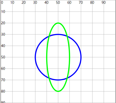
3.椭圆形
<ellipse cx="50" cy="50" rx="20" ry="20" fill="none" stroke="#00f" />
<ellipse cx="50" cy="50" rx="20" ry="30" fill="none" stroke="#0f0" />
- cx、cy:在坐标系设置原点
- rx、ry:设置x轴半径和y轴半径
- 圆形任意方向的半径相同
- 椭圆形,分为长轴半径和短轴半径
4.线条
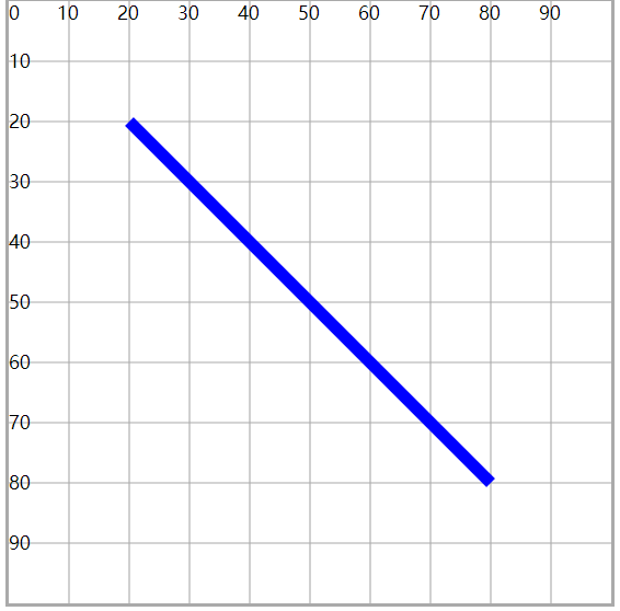
<line x1="20" y1="20" x2="80" y2="80" stroke="#00f" stroke-width="1" />
- x1、y1、x2、y2:设置线段的两个坐标点,两点之间绘制线段
- 需要设置线条的颜色和粗细
相关信息
fill属性失效
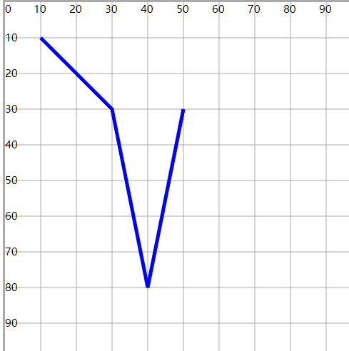
5.折线
- 多个点,一次绘制直线,最终形成一个折线效果
<polyline points="10 10,30 30,40 80,50 30" fill="none" stroke="#00f" stroke-width="1" />
- points:设置多个点的坐标值集合
- 集合数值一定是 偶数
- 每一对表示一个点的坐标,每一个值可以使用【空格】或【逗号】隔开
- 需要 描边 才会显示折线效果
注意
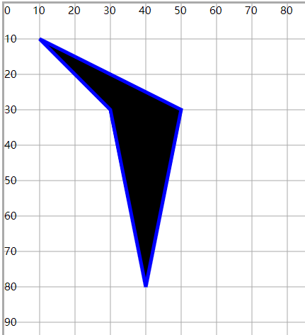
除直线效果以外,起始坐标和终止坐标之间会形成一个合围区域,默认有填充颜色
6.多边形
<polygon points="10 10,30 30,40 80,50 30" stroke="#00f" stroke-width="1" />
- 多边形与折线的绘制类似
- 不同在于终端节点和起始节点 自动联通,完成闭合 ,并有默认颜色填充
7.小任务
(五)path路径绘制
- 根据点连接,绘制各种图形
- 支持直线(线段,折线,矩形,多边形),曲线(贝塞尔曲线,弧线)
1.绘制直线
<path d="M30 30 L60 30" fill="none" stroke="#00f" stroke-width="2" />

<line x1="30" y1="40" x2="60" y2="40" stroke="#0f0" stroke-width="2" />

<polyline points="30 50,60 50" stroke="#f00" stroke-width="2" />
- d 属性:类似于折线(多边形)中的points属性,可以设置多个坐标点
- 由于 path 可以设置不同的图形(曲线),不仅仅是直线
- 所以两个坐标的连接会有不同的关键字表示
- 直线相关的关键字
- M: Move To,设置笔触所在的起始位置(要从哪个坐标位置开始画)
- L:Line To,画一条直线到指定的坐标位置
1)多个M
- 在一个 path 路径绘制的图形中,可以设置多个M
- 实现移动笔触,从多个点进行绘制
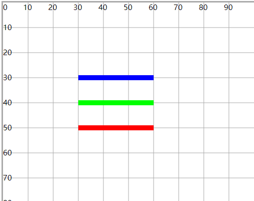
<path d="M40 30 L60 30 M30 50 L70 50 M50 30 L50 70" fill="none" stroke="#00f" stroke-width="2" />

<circle cx="40" cy="30" r="1" fill="#f00" />
<circle cx="30" cy="50" r="1" fill="#f00" />
<circle cx="50" cy="30" r="1" fill="#f00" />
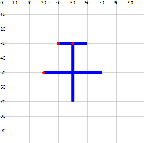
2)H 和 V 关键字
- H:只需要指定横坐标,表示横向画线
- V:只需要指定纵坐标,表示纵向画线
<path d="M30 30 H70 V70 H30" fill="none" stroke="#00f" stroke-width="2" />
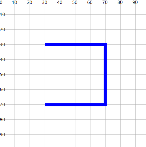
3)Z 放在最后
- 不需要跟坐标
- 表示首尾坐标闭合
<path d="M30 30 H70 V70 H30 Z" fill="none" stroke="#00f" stroke-width="2" />
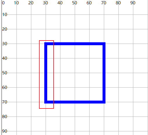
注意
- 上述的关键字大小写含义不同
M10 10 L20 20从(10, 10)点向(20, 20)点画直线(绝对位置)M10 10 l20 20从(10, 10)点开始,新位置和原位置x轴距离为20,y轴距离20(相对位置)
<circle cx="10" cy="10" r="1" fill="#f00" />
<circle cx="50" cy="50" r="1" fill="#f00" />

<path d="M10 10 L40 20" fill="none" stroke="#00f" stroke-width="2" />
<path d="M10 10 l40 20" fill="none" stroke="#0f0" stroke-width="2" />
<path d="M10 10 L40 20 m20 20 L50 50" fill="none" stroke="#00f" stroke-width="2" />
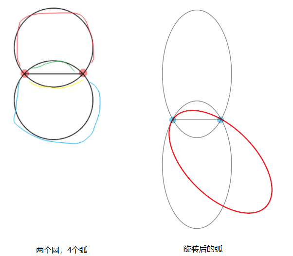
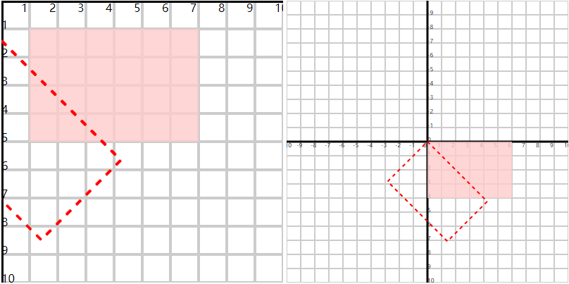
2.绘制弧线
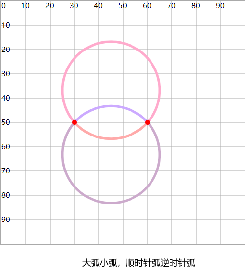
- 圆上两点之间的部分称为圆弧
1)绘制原理
- 定义两个点和一个圆
- 这个圆在绘制过程中会自动的经过两个点,从而形成了弧
2)绘制条件
- 确定两个点
(x1, y1)和(x2, y2) - 确定圆的半径
rx和ry(正圆或椭圆)- 不需要确定圆心,因为上面定义的两个点就可以大约确定圆的位置了
- 两点的距离只要小于直径,就会产生两个位置的圆(偏上,偏下)
- 两个圆会产生4条弧
- 有一种特殊情况,就是两个点恰好是直径上的两个端点,就只会形成一个圆,2条弧
- 确定画弧的方向
- 顺时针或逆时针方向
- 每个方向都可能绘制出2条弧
- 确定绘制弧的大小
- 大弧或小弧
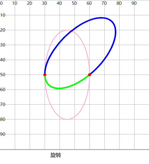
- 确定圆的旋转角度
- 对(椭)圆进行旋转,使得旋转后的圆经过定义的两点,从而形成更特别的弧
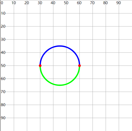
3)使用A关键字实现弧形的绘制
A rx ry rotate旋转角度 arc-flag弧大小状态(0/1) sweep-flag绘制方向(0/1) x2 y2
- A关键字绘制弧线时,不能指定起始点坐标
- 起始点坐标是由之前的绘制决定的,比如M、L
- arc-flag:0表示小弧,1表示大弧
- sweep-flag:0表示逆时针,1表示顺时针
<path d="M30 50 A15 15 0 0 1 60 50" fill="none" stroke="#00f" stroke-width="1" />
<path d="M30 50 A15 15 0 0 0 60 50" fill="none" stroke="#0f0" stroke-width="1" />

<circle cx="30" cy="50" r="1" fill="#f00" />
<circle cx="60" cy="50" r="1" fill="#f00" />
<path d="M30 50 A15 30 0 1 1 60 50" fill="none" stroke="#fac" stroke-width=".5" />
<path d="M30 50 A15 30 0 0 0 60 50" fill="none" stroke="#fac" stroke-width=".5" />
<path d="M30 50 A15 30 45 1 1 60 50" fill="none" stroke="#00f" stroke-width="1" />
<path d="M30 50 A15 30 45 0 0 60 50" fill="none" stroke="#0f0" stroke-width="1" />

<circle cx="30" cy="50" r="1" fill="#f00" />
<circle cx="60" cy="50" r="1" fill="#f00" />
<!-- 顺时针(1)大弧(1)+小弧(0) -->
<path d="M30 50 A20 20 0 1 1 60 50" fill="none" stroke="#fac" stroke-width="1" />
<path d="M30 50 A20 20 0 0 1 60 50" fill="none" stroke="#caf" stroke-width="1" />

<!-- 逆时针(0)大弧(1)+小弧(0) -->
<path d="M30 50 A20 20 0 1 0 60 50" fill="none" stroke="#cac" stroke-width="1" />
<path d="M30 50 A20 20 0 0 0 60 50" fill="none" stroke="#faa" stroke-width="1" />

<circle cx="30" cy="50" r="1" fill="#f00" />
<circle cx="60" cy="50" r="1" fill="#f00" />
3.绘制曲线
- svg支持的是贝塞尔曲线绘制(二次贝塞尔曲线、三次贝塞尔曲线)
- 贝塞尔曲线简单来说,是由 2个起点终点 和 n个控制点 配合绘制出的曲线图形
- 二次贝塞尔和三次贝塞尔,表示有 1个控制点 和 2个控制点
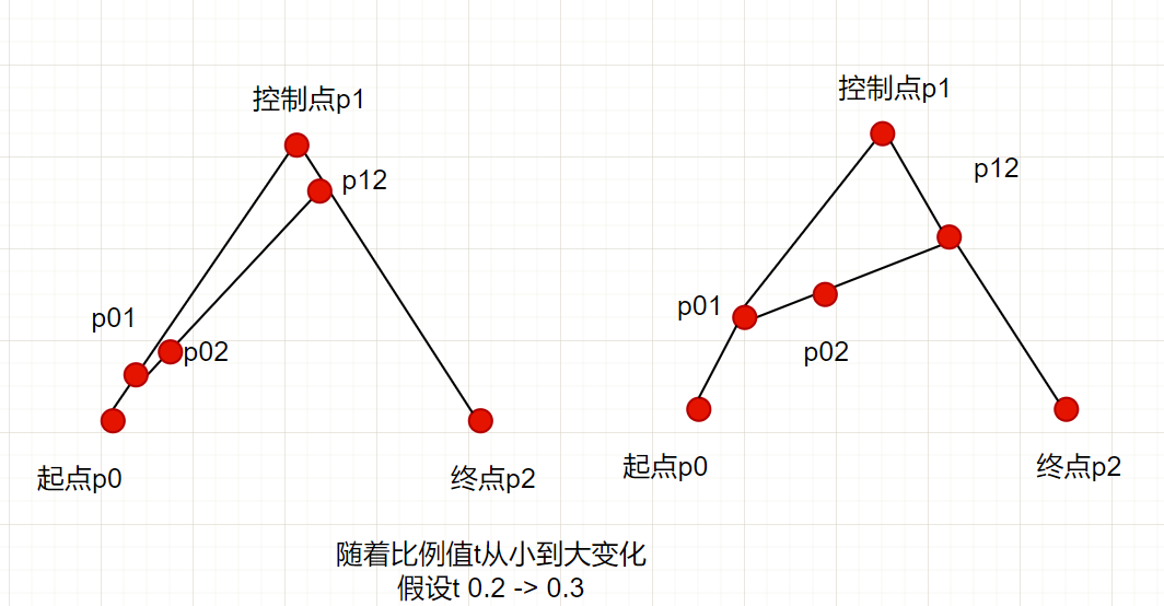
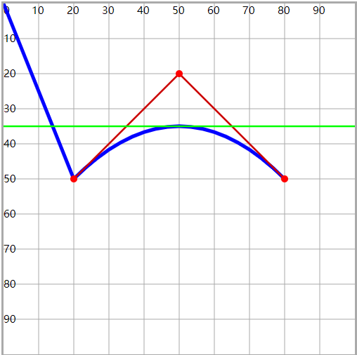
1)二次贝塞尔曲线的绘制原理
- 需要确定起点坐标p0、终点坐标p2、控制点坐标p1
- 依次连线 p0-p1-p2
- 确定一个参数t:
[0, 1] - 在p0-p1上确定一个点p01,使得
p0与p01之间的距离/p0与p1之间的距离 = t - 在p1-p2上确定一个点p12,使得
p1与p12之间的距离/p1与p2之间的距离 = t - 连接p01-p12
- 在p01-p12线段上再确定一个点p02,使得
p01与p02之间的距离/p01与p12之间的距离 = t - 按照上述规律,当t在0-1之间变化时,就可以获得n多个p02点,这n个连续的p02就会形成一个光滑的曲线
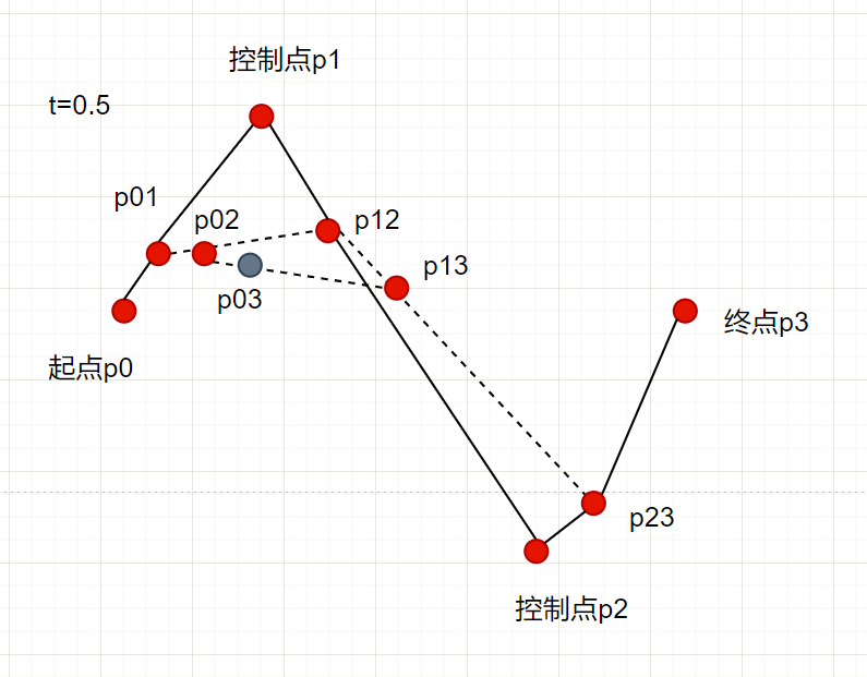
2)三次贝塞尔曲线绘制原理
- 与二次贝塞尔的绘制机制相同,只不过经过的线段和点会比二次贝塞尔曲线多一些
- 两个起始点和终点p0、p3,两个控制点p1、p2
- 按照比例t,在p0-p1中找到p01,在p1-p2中找到p12,在p2-p3中找到p23
- 按照比例t,在p01-p12中找到p02,在p12-p23中找到p13
- 按照比例t,在p02-p13中找到p03,在t变化时,会有n个连续的p03,形成曲线
3)使用Q关键字绘制二次贝塞尔曲线
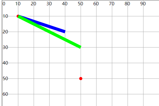
<path d="M0 0 L20 50 Q50 20,80 50" fill="none" stroke="#00f" stroke-width="1" />

<line x1="50" y1="20" x2="20" y2="50" stroke="#c00" stroke-width=".5" />
<line x1="50" y1="20" x2="80" y2="50" stroke="#c00" stroke-width=".5" />
<line x1="0" y1="35" x2="100" y2="35" stroke="#0f0" stroke-width=".5" />

<circle cx="50" cy="20" r="1" fill="#f00" />
<circle cx="20" cy="50" r="1" fill="#f00" />
<circle cx="80" cy="50" r="1" fill="#f00" />
- 与弧线绘制时相同,起始点坐标不在Q关键字中设置,而是由上一次的绘制结尾,或M控制
- 所以Q关键字中,只设置 控制点 和 终点坐标
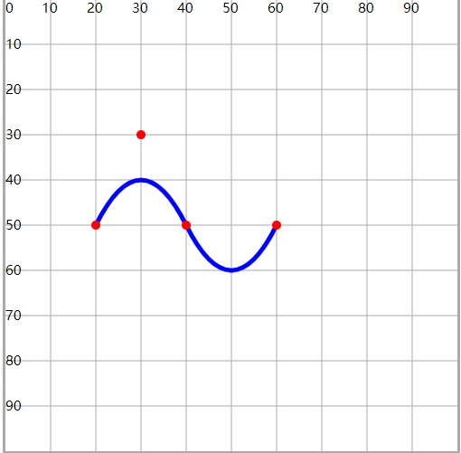
- 使用T关键字,在曲线后跟着绘制一个斜率对称的连续的二次贝塞尔曲线
- 紧跟着的这个二次贝塞尔曲线 不需要设置控制点 ,是由前一个曲线的控制点对称而来,只需要设置 终点坐标
<path d="M20 50Q30 30,40 50T60 50" fill="none" stroke="#00f" stroke-width="1" />

<circle cx="30" cy="30" r="1" fill="#f00" />
<circle cx="20" cy="50" r="1" fill="#f00" />
<circle cx="40" cy="50" r="1" fill="#f00" />
<circle cx="60" cy="50" r="1" fill="#f00" />
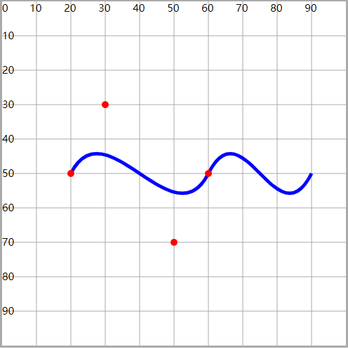
4)使用C关键字绘制三次贝塞尔曲线
<path d="M20 50 C30 30,50 70,60 50" fill="none" stroke="#00f" stroke-width="1" />

<circle cx="20" cy="50" r="1" fill="#f00" />
<circle cx="30" cy="30" r="1" fill="#f00" />
<circle cx="50" cy="70" r="1" fill="#f00" />
<circle cx="60" cy="50" r="1" fill="#f00" />
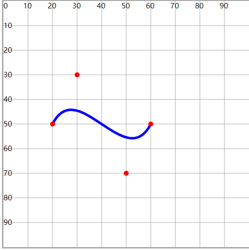
- 使用S关键字,绘制连续的三次贝塞尔曲线,与T关键字类似
- 第一个控制点不需要设置,由上一次曲线的控制点对称获得,只需要设置 第二个控制点 和 终点 即可
<path d="M20 50 C30 30,50 70,60 50S80 70 , 90 50" fill="none" stroke="#00f" stroke-width="1" />

<circle cx="20" cy="50" r="1" fill="#f00" />
<circle cx="30" cy="30" r="1" fill="#f00" />
<circle cx="50" cy="70" r="1" fill="#f00" />
<circle cx="60" cy="50" r="1" fill="#f00" />
4.小任务
(六)填充与描边
1.fill 填充属性
- fill:图形区域的颜色填充(背景颜色)
- fill-opacity:设置填充颜色的透明度
- fill-rule:
- 设置图形绘制过程中,重叠部分的所属规则
- 通过一些规则,确定重叠的区域是否属于当前图形,从而使得 填充有效或失效
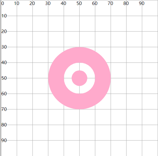
<circle cx="50" cy="50" r="20" fill="#fac" fill-opacity=".5" />
1)fill-rule="nonzero"
- 顺时针 绘制图形时经过这片区域,计数器+1
- 逆时针 绘制图形时经过这片区域,计数器-1
- 最终的结果为0,表示重叠区域不属于图形(fill失效)
- 结果非0,表示重叠区域属于图形(fill生效)
<path
  d="M30 50A20 20 0 0 1 70 50A20 20 0 0 1 30 50
    M40 50A10 10 0 0 0 60 50A10 10 0 0 0 40 50
    M45 50A5 5 0 0 0 55 50A5 5 0 0 0 45 50"
  fill="#fac"
  fill-rule="nonzero"
/>
- 一共绘制了三个圆,分别为圆30、圆40、圆45
- 顺时针绘制圆30时,圆30区域+1=1,圆40区域+1=1,圆45区域+1=1
- 逆时针绘制圆40时,圆30区域=1,圆40区域-1=0,圆45区域-1=0
- 顺时针绘制圆45时,圆30区域=1,圆40区域=0,圆45区域+1=1
- 非0表示在图形内,fill生效;0表示在图形外,fill失效
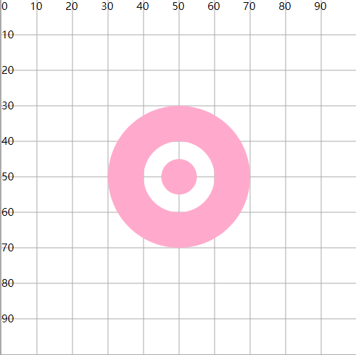
2)fill-rule="evenodd"
- 绘制过程中,经过一次区域,计数器+1
- 最终的数量为奇数,表示在图形内
- 偶数表示在图形外
<path
  d="M30 50A20 20 0 0 1 70 50A20 20 0 0 1 30 50
    M40 50A10 10 0 0 1 60 50A10 10 0 0 1 40 50
    M45 50A5 5 0 0 1 55 50A5 5 0 0 1 45 50"
  fill="#fac"
  fill-rule="evenodd"
/>
- 绘制圆30时,圆30区域+1=1,圆40区域+1=1,圆45区域+1=1
- 绘制圆40时,圆30区域=1,圆40区域+1=2,圆45区域+1=2
- 绘制圆45时,圆30区域=1,圆40区域=2,圆45区域+1=3
- 奇数表示在图形内,fill生效;偶数表示在图形外,fill失效
2.stroke 描边属性
- stroke:设置描边颜色(边框)
- stroke-width:设置描边粗细
- stroke-opacity:设置描边颜色的透明度
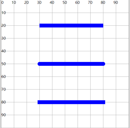
1)stroke-linecap
- 设置线段两端的形状
- butt:直边(默认)
- round:圆角边
- square:视觉效果与butt类似,两端使用了矩形形状,与butt效果相比会长出一块
<line x1="30" y1="20" x2="80" y2="20" stroke="#00f" stroke-width="3" stroke-linecap="butt" />
<line x1="30" y1="50" x2="80" y2="50" stroke="#00f" stroke-width="3" stroke-linecap="round" />
<line x1="30" y1="80" x2="80" y2="80" stroke="#00f" stroke-width="3" stroke-linecap="square" />
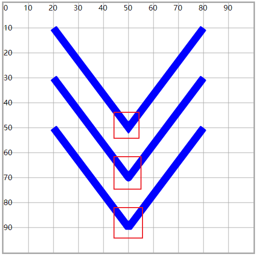
2)stroke-linejoin
- 设置折线连接点的形状
- miter:尖的(默认)
- round:圆的
- bevel:平的
<polyline points="20 10,50 50,80 10" stroke="#00f" stroke-width="3" fill="none" stroke-linejoin="miter" />
<polyline points="20 30,50 70,80 30" stroke="#00f" stroke-width="3" fill="none" stroke-linejoin="round" />
<polyline points="20 50,50 90,80 50" stroke="#00f" stroke-width="3" fill="none" stroke-linejoin="bevel" />
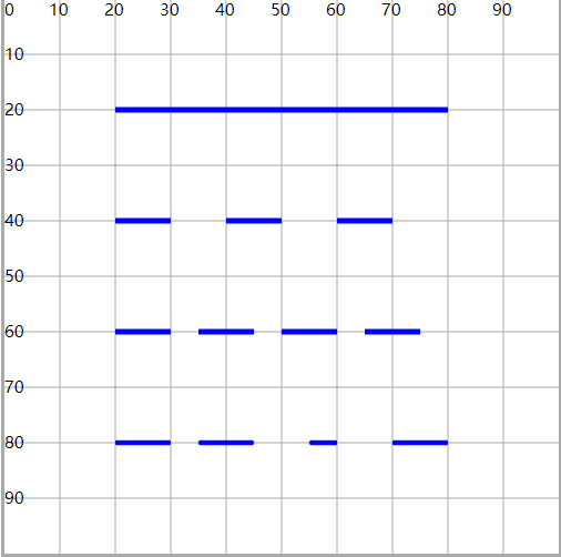
3)stroke-dasharray
- 使用虚线设置描边,并设置虚线及空白的长度
stroke-dasharray="10":每一段线长度为10,两段线之间的空白为10stroke-dasharray="10 5":每一段线长度为10,两段线之间的空白为5stroke-dasharray="10 5 10":设置时后面的长度会复制前面的数值 10 5 10 10 5 10 10 5 10
<path d="M20 20H80" fill="none" stroke="#00f" stroke-width="1" />
<path d="M20 40H80" fill="none" stroke="#00f" stroke-width="1" stroke-dasharray="10" />
<path d="M20 60H80" fill="none" stroke="#00f" stroke-width="1" stroke-dasharray="10 5" />
<path d="M20 80H80" fill="none" stroke="#00f" stroke-width="1" stroke-dasharray="10 5 10" />
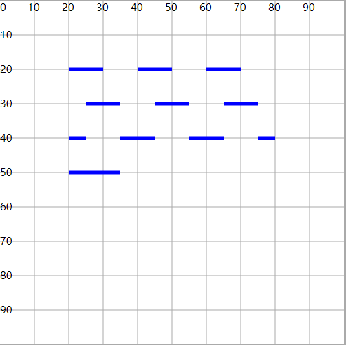
4)stroke-dashoffset
- 配合虚线描边属性,设置虚线开始的位置(偏移)
- 正数向左偏移,负数向右偏移
- 可以用来实现动态文字效果
<path d="M20 20H80" fill="none" stroke="#00f" stroke-width="1" stroke-dasharray="10" />
<path d="M20 30H80" fill="none" stroke="#00f" stroke-width="1" stroke-dashoffset="-5" stroke-dasharray="10" />
<path d="M20 40H80" fill="none" stroke="#00f" stroke-width="1" stroke-dashoffset="5" stroke-dasharray="10" />
<path d="M20 50H80" fill="none" stroke="#00f" stroke-width="1" stroke-dashoffset="45" stroke-dasharray="60" />
(七)CSS控制SVG
1.使用CSS设置SVG的效果属性(fill、stroke)
- 主要就是对fill 和 stroke系列设置
- 还允许对 r、cx、cy、x、y 属性进行设置
- 有些属性css不支持:d、points、x1、y1、x2、y2
<style>
  #c1 {
    cx: 50;
    cy: 50;
    r: 30;
    fill: #fac;
    stroke: #00f;
    fill-opacity: 0.8;
    stroke-width: 1;
    stroke-dasharray: 4 2;
  }
</style>

<circle id="c1" />
2.将CSS属性效果应用在SVG上
- 绝大多数的css效果,都可以作用在svg上面(动画、渐变、效果)
- 关于背景和边框,要使用SVG提供的属性 fill 和 stroke 设置, background 和 border无效
- after 和 before 伪类样式也不支持
<style>
  #c1 {
    fill: #fac;
    stroke: #00f;
    stroke-width: 2;
    r: 30;
    transition: 1s;
  }
  #c1:hover {
    stroke: #0f0;
    fill: #afc;
    r: 40;
  }
</style>

<circle id="c1" cx="50" cy="50" />
相关信息
- css样式可以是行内样式,也可以是内嵌样式
- svg本身是一个xml语法,可以写在.svg文件中,也可以使用样式
<svg xmlns="http://www.w3.org/2000/svg" viewBox="0 0 100 100"
    width="500" height="500" style="border:#aaa solid" >
    <style>
        circle{
            fill:#fac;
            stroke:#00f;
        }
    </style>

    <circle cx="50" cy="50" r="30" style=""/>
</svg>
(八)JS操控SVG
- 可以使用js的dom来操作svg标签
- 与之前的dom操作基本相同
- 创建标签、删除标签、操作标签(属性、样式、事件)
1.创建svg标签
const circle = document.createElementNS("http://www.w3.org/2000/svg", "circle");
- 创建svg标签的时候,需要指定 命名空间
- 否则标签可以创建,属性可以设置,但没有效果
- 所有的svg标签都可以创建:svg、circle、rect等
2.获得svg标签
document.getElementById();
document.getElementsByTagName();
document.getElementsByClassName();
document.getElementsByName();

document.querySelector();
document.querySelectorAll();
3.放置svg标签
svg.appendChild(circle);
4.操作svg标签——属性
circle.setAttribute("cx", 50);
circle.getAttribute("cx");

circle.cx = 50; // 无效 ×
注意
不能直接 [.属性名] 的方式操作属性,只能使用set和get方法操作属性
5.操作svg标签——事件
circle.onmouseover = function () {
  this.setAttribute("r", 40);
  this.style.fill = "#afc";
  this.onmouseout = function () {
    this.setAttribute("r", 20);
    this.onmouseout = null;
    this.style.fill = "#fac";
  };
};
6.操作svg标签——样式
circle.style.fill = "#fac";

console.log(circle.style.fill);
console.log(getComputedStyle(circle).fill);
7.删除svg标签
circle.ondblclick = function () {
  const b = confirm("是否确认移除");
  if (b) {
    svg.removeChild(circle);
  }
};
8.小任务
(九)Text文本元素
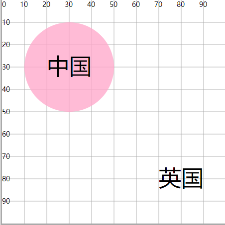
1.基本应用
<circle cx="30" cy="30" r="20" fill="#fac" fill-opacity=".8" />

<text x="20" y="33" font-size="10">中国</text>
- x:文本左边和y轴的距离
- y:文本底边和x轴的距离
- 中文的x和y在显示上会有一些视觉误差
- dx、dy:相对于x和y的偏移
<text x="20" y="33" dx="50" dy="50" font-size="10">英国</text>
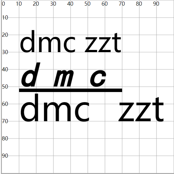
2.文本属性
| 属性 | 说明 |
|---|---|
| fill | 设置字体颜色 |
| font-size | 设置文字大小 |
| font-family | 设置字体 |
| font-style | 设置斜体 |
| font-weight | 设置粗体 |
| text-decoration | 设置文本装饰:下划线、上划线、删除线 |
| letter-spacing | 设置每一个字母之间的距离 |
| word-spacing | 设置每一个单词之间的距离 |
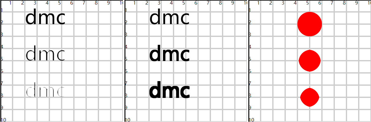
<text x="10" y="30">dmc zzt</text>

<text
  x="10"
  y="50"
  font-size="20"
  font-family="楷体"
  font-style="italic"
  font-weight="bold"
  text-decoration="underline"
  letter-spacing="10"
  word-spacing="10"
>
  dmc
</text>

<text x="10" y="70" font-size="20" word-spacing="10">dmc zzt</text>
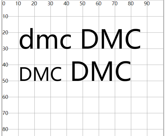
1)font-variant
- 设置文字变体
- 就是转大写,但却是小型的大写字母
<text x="10" y="30">dmc DMC</text>

<text x="10" y="50" font-variant="small-caps">dmc DMC</text>
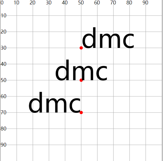
2)text-anchor
- 设置文本锚点,基于x和y坐标位置
- start:以x和y坐标为开始位置
- middle:以x和y坐标为中间位置
- end:以x和y坐标为结束位置
<circle cx="50" cy="30" r="1" fill="#f00" />
<circle cx="50" cy="50" r="1" fill="#f00" />
<circle cx="50" cy="70" r="1" fill="#f00" />
<text x="50" y="30" text-anchor="start">dmc</text>
<text x="50" y="50" text-anchor="middle">dmc</text>
<text x="50" y="70" text-anchor="end">dmc</text>
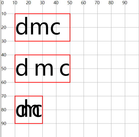
3)textLength
- 设置文本书写的空间的长度
- 文本长度>空间长度,会压缩文字
- 反之发散文字
<rect x="10" y="10" width="40" height="20" fill="none" stroke="#f00" stroke-width=".5" />
<rect x="10" y="40" width="40" height="20" fill="none" stroke="#f00" stroke-width=".5" />
<rect x="10" y="70" width="20" height="20" fill="none" stroke="#f00" stroke-width=".5" />
<text x="10" y="25">dmc</text>
<text x="10" y="55" textLength="40">dmc</text>
<text x="10" y="85" textLength="20">dmc</text>
3.tspan子标签
- 包裹部分文字,对这部分文字单独做设置
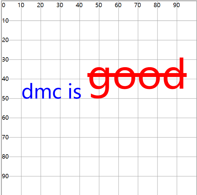
<text x="10" y="50" font-size="10" style="color:red" color="green" fill="blue">
  dmc is
  <tspan dy="-5" font-size="20" fill="red" text-decoration="line-through">good</tspan>
</text>
- x、y:基于坐标轴原点,重新设置子部分文字的位置
- dx、dy:相对于这部分文字原来的位置,重新设置新位置
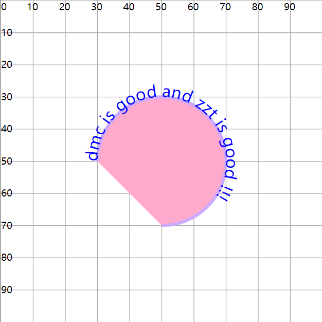
4.textPath子标签
- 文字按照path路径实现环绕(展现)
- 使用
xlink:href属性,链接指定id的path图形
<path id="p1" d="M30 50 A20 20 0 0 1 70 50A20 20 0 0 1 50 70" fill="#fac" stroke="#caf" stroke-width="1" />

<text fill="blue" font-size="5">
  <textPath xlink:href="#p1">dmc is good and zzt is good !!!</textPath>
</text>
(十)其他元素
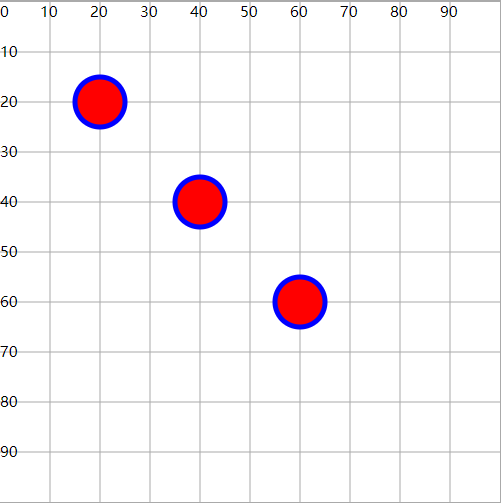
1.use元素
- 可以引用其他元素,在指定的位置绘制一个新图形(图形复用)
- x、y 是基于引用图形的坐标,不是坐标系
<circle id="c1" cx="20" cy="20" r="10" fill="red" />

<use xlink:href="#c1" x="50" y="50" />
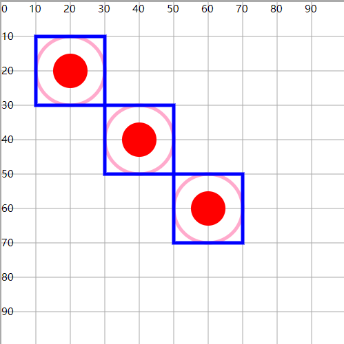
2.g元素
- 用来组合多个图形的容器, g元素本身没有任何效果
- 对一组图形统一设置(属性、动画、引用)
<g id="g2" fill="none" stroke-width="1">
  <circle id="c2" cx="20" cy="20" r="10" stroke="#fac" />
  <rect id="r2" x="10" y="10" width="20" height="20" stroke="blue" />
  <circle cx="20" cy="20" r="5" fill="red" />
</g>

<use xlink:href="#g2" x="20" y="20" />
<use xlink:href="#g2" x="40" y="40" />
3.defs元素
- 定义可重用的元素
- 可以包含多个图形,本身并不显示
- 可以配合use在多个地方复用
<defs>
  <g id="g3" fill="none" stroke-width="1">
    <circle cx="10" cy="10" r="10" stroke="#fac" />
    <rect x="0" y="0" width="20" height="20" stroke="blue" />
    <circle cx="10" cy="10" r="5" fill="red" />
  </g>
</defs>

<use xlink:href="#g3" x="20" y="20" />
<use xlink:href="#g3" x="40" y="40" />
提示
- 在后面的应用中,defs不一定只与use配合
- 例如:滤镜、渐变等
<defs>
  <linearGradient id="l1" x1="0" y1="0" x2="100%" y2="0">
    <stop offset="0%" stop-color="red" />
    <stop offset="100%" stop-color="green" />
  </linearGradient>
</defs>

<rect x="20" y="20" width="60" height="40" fill="url(#l1)" />
(十一)实战练习
1.坐标系
1)设计 100*100 的坐标范围
2)复用坐标系
- 利用js + css 动态生成坐标系
- 在网页中只需要引入js和css文件,提供一些参数即可自动生成
- 设计要求:
- 坐标系大小可否动态设置?
- 理论上可以,但不这么做,坐标系中的文字不方便控制
- 人为固定大小
200*200
- 坐标系四周有可能会有绘制需求
- 将整个坐标系区域大小设置为
250*250 - 其中可视的坐标系部分为
200*200 - 此时只需要按照
250*250的大小控制文字大小即可
- 将整个坐标系区域大小设置为
- 坐标系大小可否动态设置?
相关信息
- 逻辑上需要找到
100*100的点,在坐标系的图形中,实际找的是125*125的位置- 即:找所有的坐标点,都记得加上 25 单位的空白
- 逻辑上想要在
500*500的范围内找到250*250的坐标点怎么办?- 按照一个比例,对坐标点放缩
- 逻辑区域是
500*500, 实际区域是200*200有一个缩小比例250/500 = 0.4 - 所以
250*250对应到坐标系统中100*100,实际绘制是加上25的空白就是125*125
3)优化
- 将坐标系绘制放在一个
g标签中 - 支持 string参数(id)和对象参数
需要考虑参数默认值问题
2.折线图
3.柱状图
1)坐标系封装工具的扩展
- 原来只能绘制空的坐标系图形
- 现在希望可以增加绘制左侧和底部标签
- 由于坐标系x和y轴的标签文字有对应的样式设计,所以还需要单独设计一个coord.css,并引入至网页
4.饼状图
- 已知原点坐标、半径、角度、象限与夹角参考(y轴,y-x+象限-右上角),计算圆上指定点的坐标
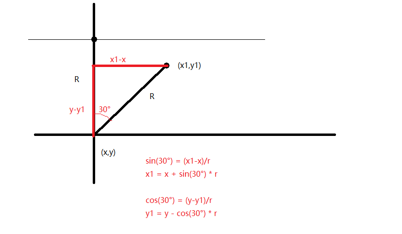
注意
Math.sin()要求传递的参数是 弧度 ,不是角度,但计算出来的是角度,所以还需要转换成弧度
- 圆周长2PIR = 2PI弧度(对应360角度)
- 1弧度 = 360角度/2PI = 180/PI(角度)
- 1角度 = PI/180(弧度)
Math.sin(30°) = Math.sin(30 * Math.PI / 180 )
二)进阶篇
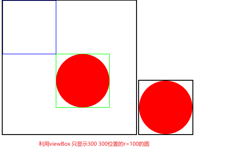
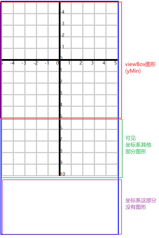
(一)viewBox属性详解
1.viewBox作用特点
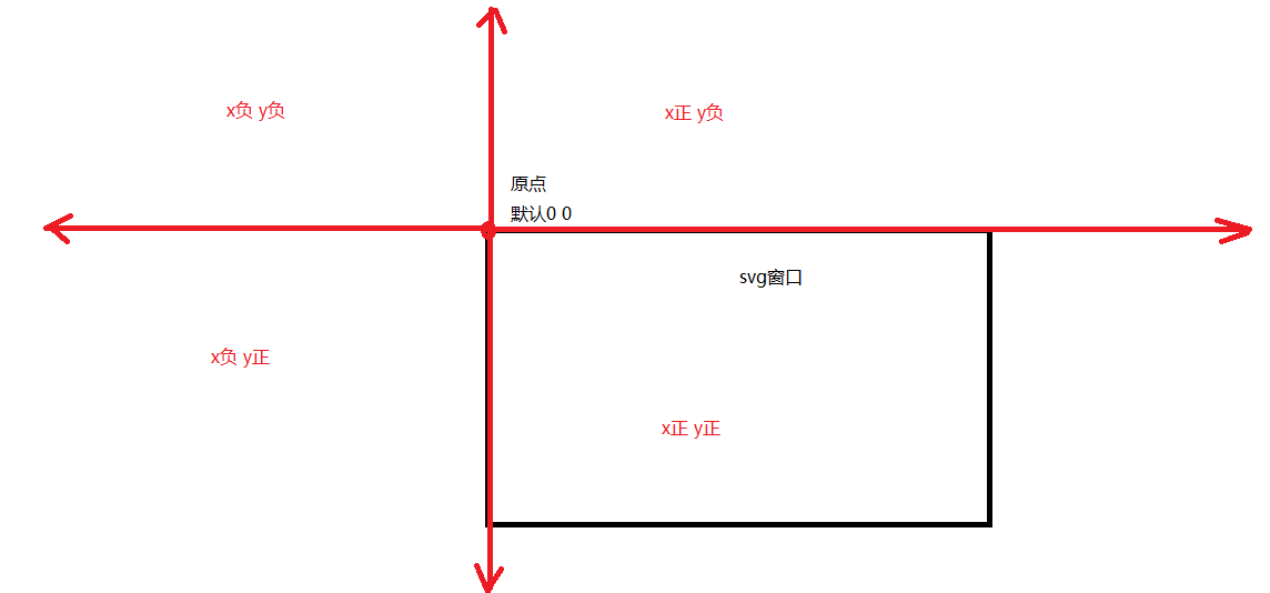
1)坐标系
- 每个svg标签都会有一个自己的坐标系
- 这个坐标系是隐式的
- 坐标系是无穷大的
这个坐标系还有其他的象限部分, 只不过默认窗口左上角为
(0, 0)点,向右为x正,向下为y正
2)viewBox属性
viewBox="x y width height"- 指定一个视口的大小和位置,用来展示坐标系中指定的部分
- x、y:设置视口的起始位置
- width、height:设置视口的区域
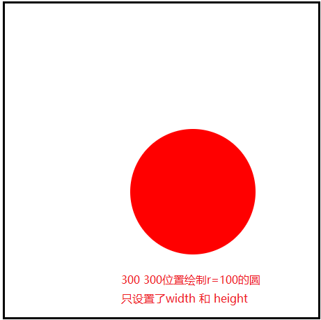
<svg id="svg" width="500" height="500" style="border:solid #000;">
  <circle cx="300" cy="300" r="100" fill="red" />
</svg>
<svg id="svg" width="200" height="200" viewBox="200 200 200 200" style="border:solid #000;">
  <circle cx="300" cy="300" r="100" fill="red" />
</svg>
3)width和height
- 确定最终图形展示的大小
- 首先,使用viewBox确定了要展示图形的部分(位置)
- 接下来就可以使用width和height设置展示图形的大小
- 如果width和height的区域比viewBox区域大,就会 等比例放大,否则会 等比例缩小
<svg id="svg" width="500" height="500" viewBox="200 200 200 200" style="border: solid #000">
  <circle cx="300" cy="300" r="100" fill="red" />
</svg>
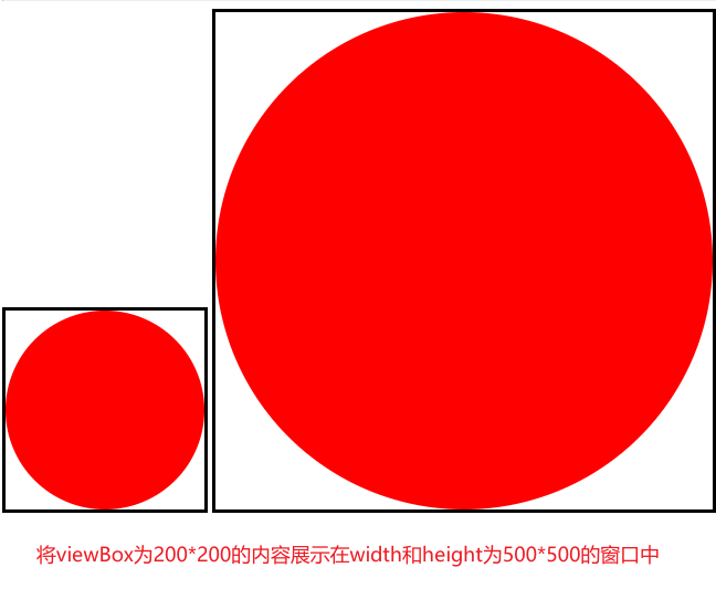
注意
- svg默认的宽高是
300*150 - 一旦设置了viewBox,会默认撑满窗口
- 如果只设置了width和height,没有设置viewBox,则viewBox默认为
0 0 width height - 一般都会设置 viewBox 配合 width 和 height
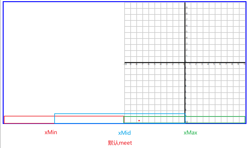
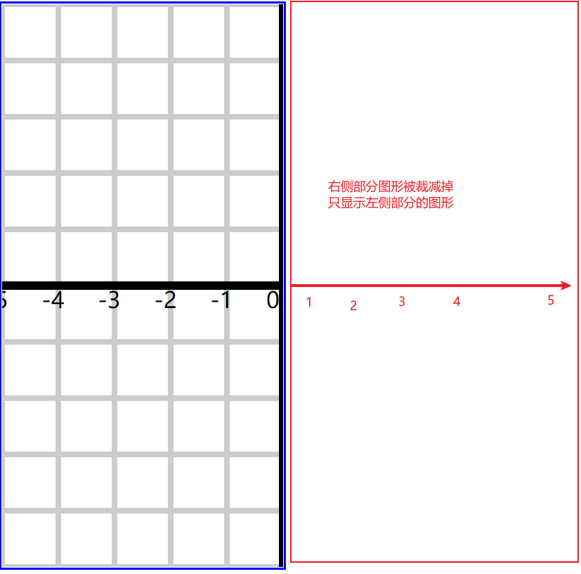
2.preserveAspectRatio属性
- 保持(宽高)方面比例
- 当
viewBox.宽高与svg.宽高不一致时,默认会进行 等比例缩放 - 之前都是让viewBox与svg的宽高比相同(人为控制)
- 当
svg.宽高比与viewBox.宽高比不同时,图形又需要 按照viewBox.宽高比缩放
假设:
viewBox.width=100 viewBox.height=100 比例1:1情况一:
svg.width=200 svg.height=200 比例1:1此时正常放缩
情况二:
svg.width=200 svg.height=400 比例1:2viewBox图形必须按照1:1放大此时viewBox放缩后会有两种宽高
200*200、400*400这个时候,是按照小的缩放,还是按照大的缩放?缩放后会有什么效果?如何控制位置?就由preserveAspectRatio属性控制

注意
viewBox图形区域的宽高比不一定是1:1
1)preserveAspectRatio 属性在设置的时候有两部分值
preserveAspectRatio ="align meetOrSlice"- 第一部分:图形在窗口中的位置
xMin xMid xMax yMin yMid yMax。- 一共有上述9个组合
xMinYMin xMidYMin xMaxYMin xMinYMid ..... - 只会存在一个方向的位置关系,只会有一个方向生效,要么左中右,要么上中下
- 一共有上述9个组合
- 第二部分:图形放缩时参考的
svg.宽高数值- 参考大的,还是参考小的
- meet(默认)
- viewBox图形会按照 小 的数值放缩,此时窗口区域就会多出一部分
- 这一部分可以显示viewBox没有包含到那部分坐标系内容(可见的)
preserveAspectRatio="xMaxYMin meet"
- slice
- viewBox图形会按照 大 的数值放缩,此时窗口过小,装不下图形
- 所以需要在viewBox图形中切一部分在窗口中展示
preserveAspectRatio="xMaxYMin slice"
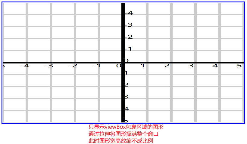
2)不按照等比例缩放
preserveAspectRatio="none"- 将viewBox图形按照现有的svg宽高比例拉伸
<svg id="svg" viewBox="-100 -100 200 200" width="800" height="400" style="padding: 1px; border: solid #00f" preserveAspectRatio="xMaxYMax"></svg>
<svg id="svg" viewBox="-50 -50 100 100" width="400" height="800" style="padding: 1px; border: solid #00f" preserveAspectRatio="xMaxYMin meet"></svg>
<svg id="svg" viewBox="-50 -50 100 100" width="400" height="800" style="padding: 1px; border: solid #00f" preserveAspectRatio="xMinYMin slice"></svg>
<svg id="svg" viewBox="-50 -50 100 100" width="800" height="400" style="padding: 1px; border: solid #00f" preserveAspectRatio="none"></svg>
(二)颜色渐变
- 图形的填充和描边可以使用渐变色
- 渐变色的使用分为:定义渐变色、引用渐变色
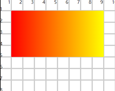
1.线性渐变
- 沿着直线进行颜色渐变(横向、纵向、斜向)
- 使用
<linearGradient>标签定义线性渐变
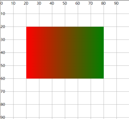
<defs>
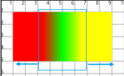
<linearGradient id="gradient1" x1="0%" y1="0%" x2="100%" y2="0%">
<stop offset="0%" stop-color="#f00" stop-opacity="1" />
<stop offset="100%" stop-color="#ff0" stop-opacity="1" />
</linearGradient>
</defs>
<rect x="10" y="10" width="80" height="40" fill="url(#gradient1)" />
- x1、y1、x2、y2:设置线条的两个端点
- 按照线条方向渐变
- 横向、纵向、斜向
- x、y:位置用百分比设置,x是width的百分比,y是height的百分比
<stop>设置每一阶段渐变的颜色和透明度
<defs>不写也可以实现渐变定义- 设置线性坐标点时,不一定非要从头到尾(0 or 100%)
- 如果设置了中间数值,就在中间位置渐变
- 两边就是起始和终止的颜色
<defs>
  <linearGradient id="gradient4" x1="30%" y1="100%" x2="70%" y2="100%">
    <stop offset="0%" stop-color="#f00" stop-opacity="1" />
    <stop offset="50%" stop-color="#0f0" stop-opacity="1" />
    <stop offset="100%" stop-color="#ff0" stop-opacity="1" />
  </linearGradient>
</defs>

<rect x="10" y="10" width="80" height="40" fill="url(#gradient4)" />
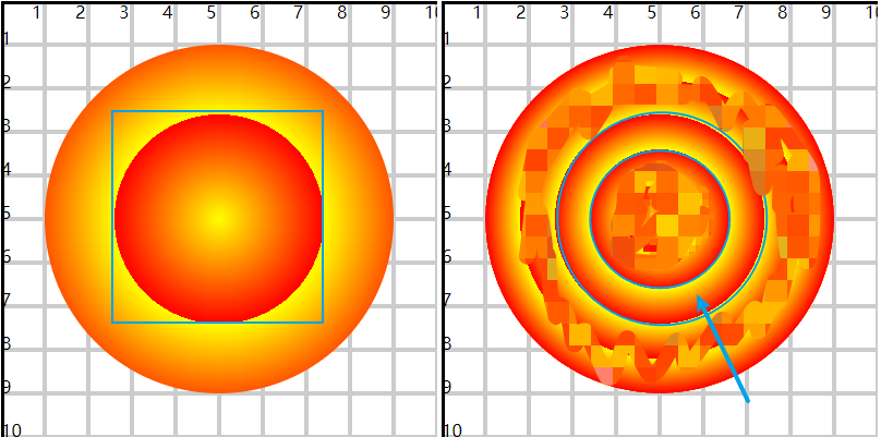
2.径向渐变
- 从一个起始点开始,从里向外圆形渐变
- 使用
<radialGradient>标签定义径向渐变
<defs>
  <radialGradient id="gradient1">
    <stop offset="0" stop-color="#ff0" />
    <stop offset="100%" stop-color="#f00" />
  </radialGradient>
</defs>

<circle cx="50" cy="50" r="40" fill="url(#gradient1)" />
- 默认在整个图形区域进行渐变
- 使用cx、cy、r、fr控制渐变的区域
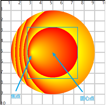
- cx、cy:定义原点位置
- fr:设置渐变起始位置圆的半径,fr没有设置,就是以圆点向外渐变
- r:设置渐变终止位置圆的半径
<defs>
  <radialGradient id="gradient2" cx="50%" cy="50%" r="30%" spreadMethod="repeat">
    <stop offset="0" stop-color="#ff0" />
    <stop offset="100%" stop-color="#f00" />
  </radialGradient>
</defs>

<circle cx="50" cy="50" r="40" fill="url(#gradient2)" />
<defs>
  <radialGradient id="gradient3" cx="50%" cy="50%" r="30%" fr="20%" spreadMethod="repeat">
    <stop offset="0" stop-color="#ff0" />
    <stop offset="100%" stop-color="#f00" />
  </radialGradient>
</defs>

<circle cx="50" cy="50" r="40" fill="url(#gradient3)" />
- 这里的cx、cy、r百分比,都是基于圆直径的百分比
cx="25%" cy="50%" r="25%"表示x轴直径的25%位置,y轴直径的50%位置,半径长度为直径的25%- 如果是椭圆,分别是基于长轴直径和短轴直径的百分比
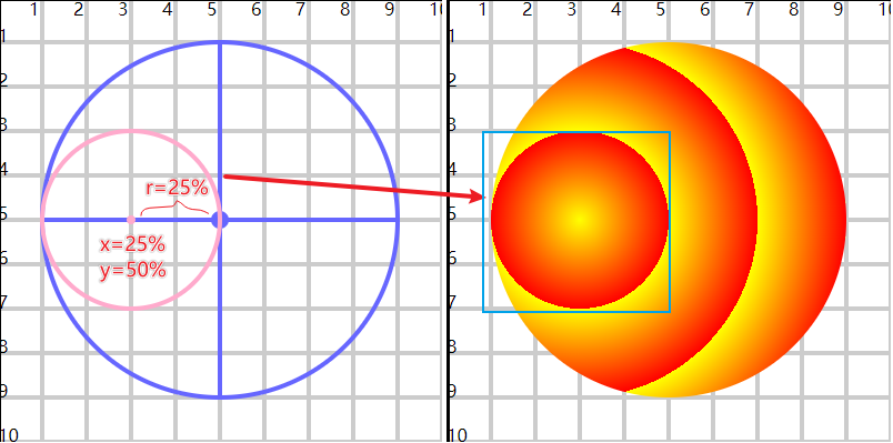
- 使用fx、fy设置渐变的 焦点 位置,从焦点位置向外开始渐变
- cx、cy、r、fr 用来控制渐变的区域
- 焦点如果离开渐变范围,无法显示正常效果
<defs>
  <radialGradient id="gradient5" cx="50%" cy="50%" r="30%" fx="25%" fy="50%" spreadMethod="repeat">
    <stop offset="0" stop-color="#ff0" />
    <stop offset="100%" stop-color="#f00" />
  </radialGradient>
</defs>

<circle cx="50" cy="50" r="40" fill="url(#gradient5)" />
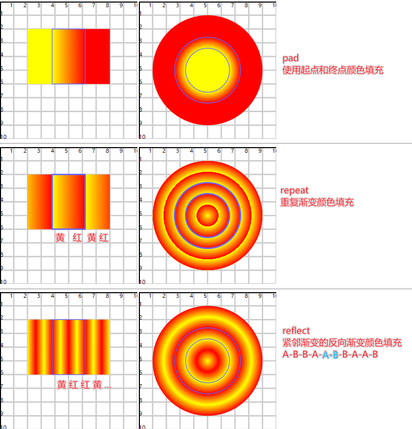
3.spreadMethod属性详解
- 在缩小渐变范围后,设置扩展部分的渐变效果
- pad(默认值):表示使用起点和终点颜色,填充扩展的部分
- repeat:重复当前的渐变颜色,分别作用在扩展的两个部分中
- reflect:按照渐变的反向顺序,作用在扩展的两个部分中;如果扩展部分依然有剩余,继续反向填充
C-B-A-**A-B-C**-C-B-A-A-B-C
<radialGradient spreadMethod="repeat"></radialGradient>
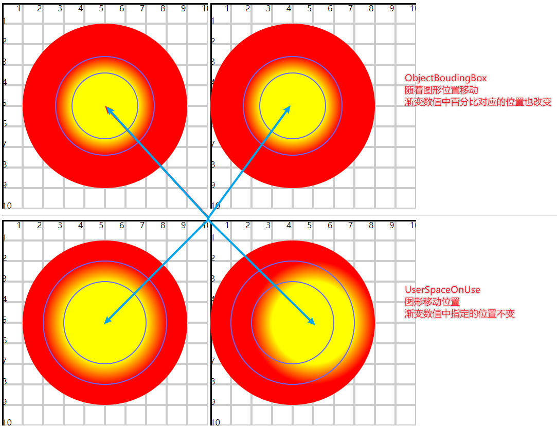
4.gradientUnits属性详解
1)设置渐变单元
- 在设置渐变区域时,需要设置一些数值
- 这些数值可以使用相对单位(百分比),也可以使用绝对单位(px)
<defs>
  <radialGradient id="gradient2" r="30%" fr="20%">
    <stop offset="0%" stop-color="#ff0" stop-opacity="1" />
    <stop offset="100%" stop-color="#f00" stop-opacity="1" />
  </radialGradient>
</defs>

<!-- 50移动到40位置 -->
<circle cx="50" cy="50" r="40" fill="url(#gradient2)" />
<circle cx="50" cy="50" r="24" fill="none" stroke="#66f" stroke-width=".5" />
<circle cx="50" cy="50" r="16" fill="none" stroke="#66f" stroke-width=".5" />
a)ObjectBoundingBox
- 默认值,使用百分比
- 所有图形最终都会形成一个矩形区域,这里的百分比都是基于矩形的宽高
- 线性渐变中,x1、x2 基于矩形width,y1、y2 基于矩形height
- 径向渐变中,cx、fx 基于矩形width,cy、fy基于矩形height,r、fr同时基于width、height
- 图形移动,效果位置会跟随
b)userSpaceOnUse
- 使用绝对值
- 参考坐标系
- 图形移动,效果位置不动
<defs>
  <radialGradient id="gradient4" gradientUnits="userSpaceOnUse" cx="50" cy="50" fr="20" r="30">
    <stop offset="0%" stop-color="#ff0" stop-opacity="1" />
    <stop offset="100%" stop-color="#f00" stop-opacity="1" />
  </radialGradient>
</defs>

<!-- 50移动到40位置 -->
<circle cx="50" cy="50" r="40" fill="url(#gradient4)" />
<circle cx="50" cy="50" r="30" fill="none" stroke="#66f" stroke-width=".5" />
<circle cx="50" cy="50" r="20" fill="none" stroke="#66f" stroke-width=".5" />
5.渐变引用
- 使用href属性引用另外一个渐变的颜色设置
<defs>
  <radialGradient id="gradient1" fr="15%" r="30%" spreadMethod="repeat">
    <stop offset="0%" stop-color="#ff0" stop-opacity="1" />
    <stop offset="100%" stop-color="#f00" stop-opacity="0.5" />
  </radialGradient>

  <radialGradient id="gradient2" fr="15%" r="30%" spreadMethod="reflect" href="#gradient1" />
</defs>

<circle cx="25" cy="25" r="25" fill="url(#gradient1)" />
<circle cx="75" cy="75" r="25" fill="url(#gradient2)" />
注意
引用的是颜色的渐变过程,与哪种渐变方式无关
<defs>
  <radialGradient id="gradient3" fr="15%" r="30%" spreadMethod="repeat">
    <stop offset="0%" stop-color="#ff0" stop-opacity="1" />
    <stop offset="100%" stop-color="#f00" stop-opacity="0.5" />
  </radialGradient>
  <linearGradient id="gradient4" x1="40%" x2="60%" spreadMethod="repeat" href="#gradient3" />
</defs>

<rect x="20" y="60" width="60" height="30" fill="url(#gradient3)" />
<circle cx="30" cy="30" r="25" fill="url(#gradient4)" />
(三)变形
- 平移、旋转、缩放、斜切
- transform属性可以实现变形
- 使用不同的变形函数完成对应图形变化
- translate、rotate、scale、skew
1.平移
<rect x="10" y="10" width="60" height="40" fill="#fcc" fill-opacity="0.8" />
<rect x="10" y="10" width="60" height="40" fill="none" stroke="#f00" stroke-dasharray="2.5" transform="translate(20)" />
<rect x="10" y="10" width="60" height="40" fill="none" stroke="#0f0" stroke-dasharray="2.5" transform="translate(0,20)" />
<rect x="10" y="10" width="60" height="40" fill="none" stroke="#00f" stroke-dasharray="2.5" transform="translate(10,10)" />
- 没有指定y时默认为0
2.旋转
<rect x="0" y="0" width="60" height="40" fill="#fcc" fill-opacity="0.8" />
<rect x="0" y="0" width="60" height="40" fill="none" stroke="#f00" stroke-dasharray="2.5" transform="rotate(45)" />
- 默认是以坐标系原点进行旋转
- 可以设置旋转中心点
- 利用rotate函数指定旋转的中心点
rotate(45, 30, 20) - 利用
transform-origin="30 20"
- 利用rotate函数指定旋转的中心点
<rect x="10" y="10" width="60" height="40" fill="#fcc" fill-opacity="0.8" />
<rect x="10" y="10" width="60" height="40" fill="none" stroke="#f00" stroke-dasharray="2.5" transform="rotate(45)" transform-origin="40 30" />
<rect x="10" y="10" width="60" height="40" fill="none" stroke="#00f" stroke-dasharray="2.5" transform="rotate(45,70,50)" />

<circle cx="40" cy="30" r="1" style="fill:red;" />
<circle cx="70" cy="50" r="1" style="fill:blue;" />
3.放缩
<rect x="10" y="10" width="60" height="40" fill="#fcc" fill-opacity="0.8" />
<rect x="10" y="10" width="60" height="40" fill="none" stroke="#f00" stroke-dasharray="2.5" transform="scale(0.4)" transform-origin="40 30" />
<rect x="10" y="10" width="60" height="40" fill="none" stroke="#0f0" stroke-dasharray="2.5" transform="scale(1,0.5)" transform-origin="40 30" />
<rect x="10" y="10" width="60" height="40" fill="none" stroke="#00f" stroke-dasharray="2.5" transform="scale(0.5,1)" transform-origin="40 30" />
- 没有指定y时默认与x值相同
- 放缩后的位置,默认会参考
(0, 0)原点 - 可以使用
transform-origin设置新的原点位置
4.斜切
- 两个函数 skewX 和 skewY
<rect x="0" y="0" width="60" height="40" fill="#fcc" fill-opacity="0.8" />
<rect x="0" y="0" width="60" height="40" fill="none" stroke="#f00" stroke-dasharray="2.5" transform="skewX(30)" />
- skewX 延x轴方向拉拽,最终与y轴形成指定的夹角
- 默认是基于
(0, 0)点的一个斜切,可以重新设置中间点
- 中心点在某一个边上,倾斜时该边不动,其余3边有变化
- 中心点在图形中,倾斜时4个边都有变化
<rect x="20" y="20" width="60" height="40" fill="#fcc" fill-opacity="0.8" />
<rect x="20" y="20" width="60" height="40" fill="none" stroke="#f00" stroke-dasharray="2.5" transform="skewX(30)" transform-origin="50 40" />
<rect x="20" y="20" width="60" height="40" fill="none" stroke="#0f0" stroke-dasharray="2.5" transform="skewX(30)" transform-origin="50 20" />
<rect x="20" y="20" width="60" height="40" fill="none" stroke="#00f" stroke-dasharray="2.5" transform="skewX(30)" transform-origin="50 60" />

<circle cx="50" cy="40" r="2" fill="#f00" />
<circle cx="50" cy="20" r="2" fill="#0f0" />
<circle cx="50" cy="60" r="2" fill="#00f" />
(四)嵌入图片
- 在svg嵌入一个图片(位图,矢量图)可以使用svg效果(变形、裁剪、遮罩、滤镜)
1.使用 <image> 标签嵌入指定的图片
<image href="../imgs/1.png" x="10" y="10" width="80" height="80" transform="rotate(45,50,50)" />
- href 引入指定的图片,可以是本地图片,也可以是网络图片
- x 和 y 设置引入图片放置的起始位置,默认是
(0, 0)原点 - width 和 height 是对引入图片的宽高放缩,默认就是图片的原始宽高
2.preserveAspectRatio
- 可以在使用 width 和 height 放缩时指定放缩比例保持状态
<svg width="400" height="400" viewBox="0 0 100 100">
  <image href="../imgs/1.png" x="0" y="0" width="100" height="100" preserveAspectRatio="xMinYMin meet" />
</svg>

<svg width="400" height="400" viewBox="0 0 100 100">
  <image href="../imgs/1.png" x="0" y="0" width="100" height="100" preserveAspectRatio="xMaxYMid slice" />
</svg>

<svg width="400" height="400" viewBox="0 0 100 100">
  <image href="../imgs/1.png" x="0" y="0" width="100" height="100" preserveAspectRatio="none" />
</svg>
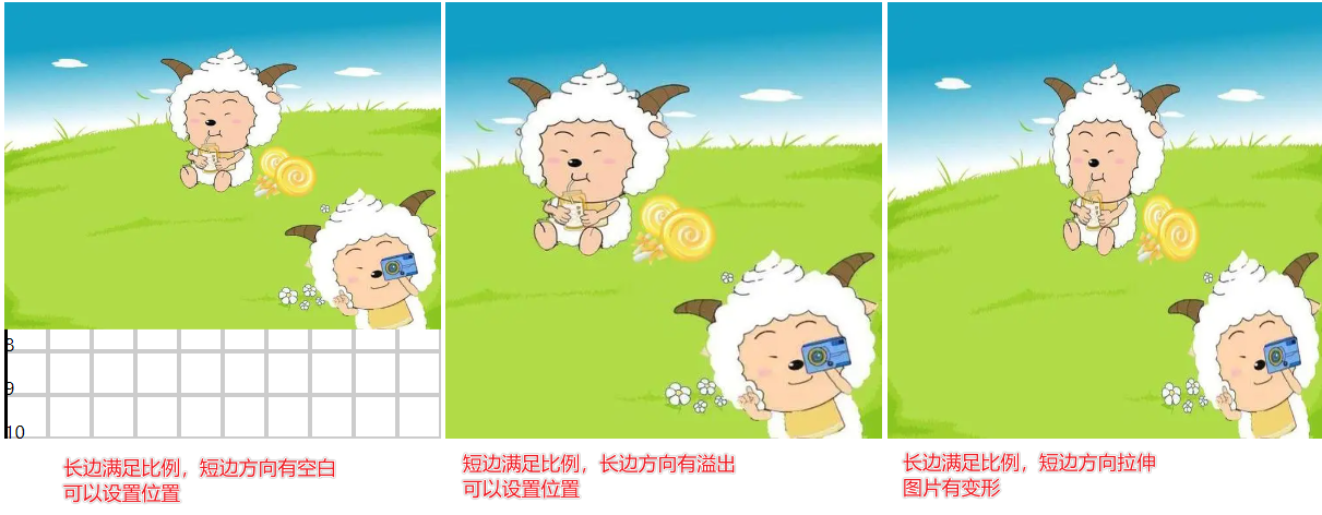
相关信息
位图放大之后会有失真的情况
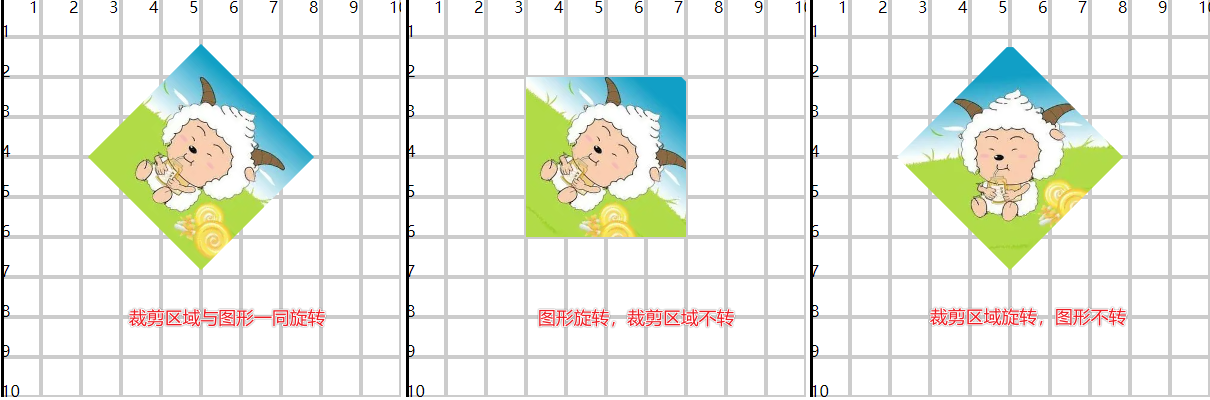
(五)裁剪与遮罩
- 擦除已创建图形的部分内容
1.裁剪路径
- 裁剪路径是由 path、text、基本图形组成的图形,将其作用在目标图形上,裁剪路径内的图形是可见的
- 剪路径图形本身的颜色和透明度是无效的,只使用图形的区域,但 变形是生效 的
- 使用
<clipPath>标签定义裁剪路径,目标图形使用clip-path属性引用裁剪路径
1)可以是基本图形或path路径合围图形
<defs>
  <clipPath id="clip1">
    <circle cx="50" cy="45" r="20" fill="#f00" fill-opacity="0.8" />
  </clipPath>
</defs>

<rect x="20" y="20" width="60" height="50" fill="#fac" clip-path="url(#clip1)" />
<rect x="20" y="20" width="60" height="50" fill="none" stroke="#00f" stroke-width=".5" stroke-dasharray="2.5" />
2)裁剪路径作用在组合图形上
<defs>
  <clipPath id="clip2">
    <rect x="30" y="30" width="40" height="40" />
  </clipPath>
</defs>

<g clip-path="url(#clip2)">
  <circle cx="50" cy="30" r="15" fill="#fac" />
  <circle cx="50" cy="70" r="15" fill="#fca" />
</g>
<g fill="none" stroke="#00f" stroke-width=".5" stroke-dasharray="2.5">
  <circle cx="50" cy="30" r="15" />
  <circle cx="50" cy="70" r="15" />
</g>
3)裁剪路径作用在图片上
<defs>
  <clipPath id="clip3">
    <rect x="30" y="20" width="40" height="40" />
    <rect x="60" y="50" width="40" height="40" />
  </clipPath>
</defs>

<image href="../imgs/1.png" height="100" width="100" clip-path="url(#clip13)" />
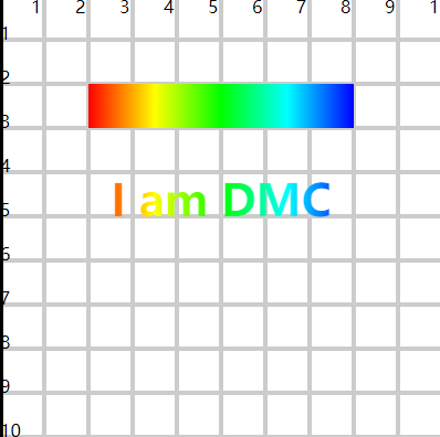
4)使用文字作为裁剪路径
<defs>
  <clipPath id="clip4">
    <text x="50" y="50" font-size="10" text-anchor="middle" font-weight="bold">I am DMC</text>
  </clipPath>
  <linearGradient id="gradient1">
    <stop offset="0" stop-color="#f00" stop-opacity="1" />
    <stop offset=".25" stop-color="#ff0" stop-opacity="1" />
    <stop offset=".5" stop-color="#0f0" stop-opacity="1" />
    <stop offset=".75" stop-color="#0ff" stop-opacity="1" />
    <stop offset="1" stop-color="#00f" stop-opacity="1" />
  </linearGradient>
</defs>

<rect x="20" y="40" width="60" height="40" fill="url(#gradient1)" clip-path="url(#clip4)" />
5)裁剪路径配合变形
<svg width="400" height="400" viewBox="0 0 100 100">
  <defs>
    <clipPath id="clip5">
      <rect x="30" y="20" width="40" height="40" />
    </clipPath>
  </defs>
  <image href="../imgs/1.png" height="100" width="100" clip-path="url(#clip5)" transform="rotate(45,50,40)" />
</svg>

<svg width="400" height="400" viewBox="0 0 100 100">
  <defs>
    <clipPath id="clip6">
      <rect x="30" y="20" width="40" height="40" />
    </clipPath>
  </defs>
  <g clip-path="url(#clip6)">
    <image href="../imgs/1.png" height="100" width="100" transform="rotate(45,50,40)" />
  </g>
</svg>

<svg width="400" height="400" viewBox="0 0 100 100">
  <defs>
    <clipPath id="clip7">
      <rect x="30" y="20" width="40" height="40" transform="rotate(45,50,40)" />
    </clipPath>
  </defs>
  <image href="../imgs/1.png" height="100" width="100" clip-path="url(#clip7)" />
</svg>
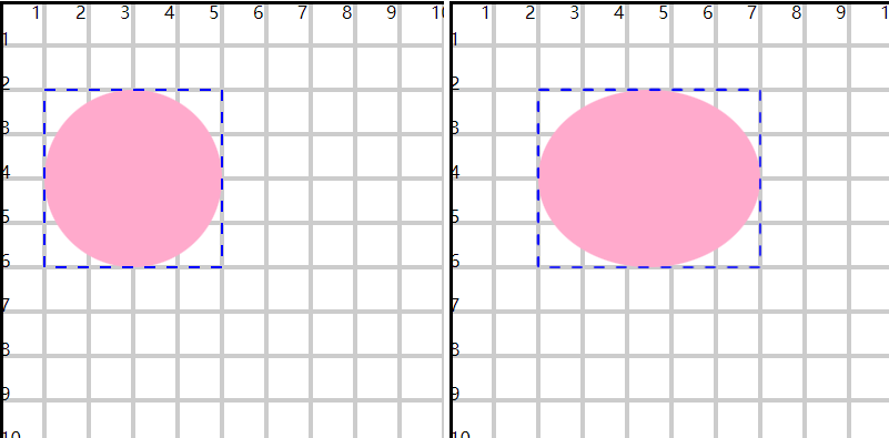
6)裁剪路径的 clipPathUnits 属性
- 有两个值
a)userSpaceOnUse
- 默认值
- 设置裁剪路径时,使用具体数值设置,参考坐标系(绝对路径)
- 裁剪区域不变,随着目标图形位置和大小改变,最终的裁剪结果会发生变化
b)objectBoundingBox
- 基于裁剪路径所应用的图形,使用百分比设置(相对路径)
- 裁剪区域相对于目标图形,无论目标图形的位置和大小如何改变,裁剪区域的计算不变
<defs>
  <clipPath id="clip8" clipPathUnits="objectBoundingBox">
    <circle cx=".5" cy=".5" r=".5" />
  </clipPath>
</defs>

<rect x="10" y="20" width="40" height="40" fill="#fac" clip-path="url(#clip8)" />
<rect x="10" y="20" width="40" height="40" fill="none" stroke="#00f" stroke-width=".5" stroke-dasharray="2.5" />
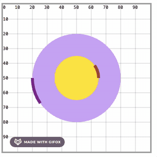
2.遮罩
- 裁剪路径只能控制图形区域展示或不展示
- 遮罩不仅仅可以控制图形区域的展示与否,还可以控制透明度,还可以层叠(一部分展示,这部分中的小部分不展示)
- 使用
<mask>标签定义遮罩,图形使用mask属性引用遮罩
1)基本应用
<defs>
  <mask id="mask1">
    <circle cx="40" cy="50" r="20" fill="#fff" />
  </mask>
</defs>

<rect x="20" y="30" width="60" height="40" fill="#fac" mask="url(#mask1)" />
<rect x="20" y="30" width="60" height="40" fill="none" stroke="#00f" stroke-width=".5" stroke-dasharray="2.5" />
- 遮罩的区域会透明化,所以背后的图形是可见的
- 在遮罩中设计路径(path、text、基础图形),指定颜色
- white 表示显示
- black 表示不显示
- gray 表示半透明显示
2)层叠应用
<defs>
  <mask id="mask2">
    <circle cx="40" cy="50" r="20" fill="white" />
    <circle cx="40" cy="50" r="10" fill="black" />
    <circle cx="40" cy="50" r="5" fill="gray" />
  </mask>
</defs>

<rect x="20" y="30" width="60" height="40" fill="#fac" mask="url(#mask2)" />
<rect x="20" y="30" width="60" height="40" fill="none" stroke="#00f" stroke-width=".5" stroke-dasharray="2.5" />
3)渐变应用
<defs>
  <linearGradient id="gradient3">
    <stop offset="0" stop-color="#fff" stop-opacity="0" />
    <stop offset="1" stop-color="#fff" stop-opacity="1" />
  </linearGradient>
  <mask id="mask3">
    <rect x="20" y="30" width="60" height="40" fill="url(#gradient3)" />
  </mask>
</defs>

<rect x="20" y="30" width="60" height="40" fill="#fac" mask="url(#mask3)" />
<rect x="20" y="30" width="60" height="40" fill="none" stroke="#00f" stroke-width=".5" stroke-dasharray="2.5" />
- 遮罩中的颜色最终会落实到透明度上,所以都设置#fff,直接控制透明度也是可以的
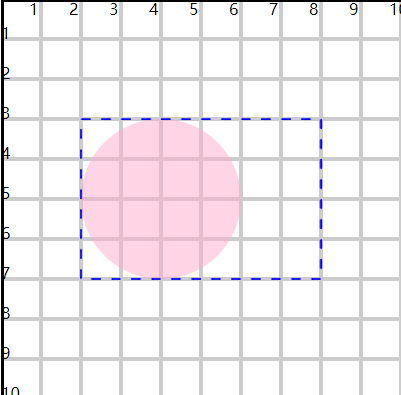
4)maskContentUnits 属性
- userSpaceOnUse
- 默认值
- 位置、区域范围参考坐标系使用具体数值
- 图形位置和大小改变,遮罩位置和区域不变
- objectBoundingBox
- 位置和区域范围参考坐标系使用百分比
- 可以随意更改图形的大小和位置
<defs>
  <linearGradient id="gradient4">
    <stop offset="0" stop-color="#000" />
    <stop offset="1" stop-color="#fff" />
  </linearGradient>
  <mask id="mask4" maskContentUnits="objectBoundingBox">
    <rect x="0" y="0" width="1" height="1" fill="url(#gradient4)" />
  </mask>
</defs>

<rect x="10" y="20" width="40" height="20" fill="#fac" mask="url(#mask4)" />
<rect x="10" y="20" width="40" height="20" fill="none" stroke="#00f" stroke-width=".5" stroke-dasharray="2.5" />
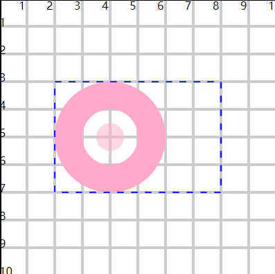
5)maskUnits属性
- mask标签本身有 x、y、width、height 属性可以用来调整遮罩效果的范围,只允许在指定区域应用遮罩
- 此时还要配合 maskUnits属性
- objectBoundingBox
- 默认值
- 默认参考图形
- userSpaceOnUse
- 参考坐标系
- objectBoundingBox
<defs>
  <linearGradient id="gradient5">
    <stop offset="0" stop-color="#000" />
    <stop offset="1" stop-color="#fff" />
  </linearGradient>
  <mask id="mask5" x="0" y="0" width=".5" height=".5" maskContentUnits="objectBoundingBox" maskUnits="objectBoundingBox">
    <rect x="0" y="0" width="1" height="1" fill="url(#gradient5)" />
  </mask>
</defs>

<rect x="10" y="20" width="60" height="40" fill="#fac" mask="url(#mask5)" />
<rect x="10" y="20" width="60" height="40" fill="none" stroke="#00f" stroke-width=".5" stroke-dasharray="2.5" />
6)小案例
<defs>
  <linearGradient id="gradient61">
    <stop offset="0" stop-color="#333" />
    <stop offset="1" stop-color="#fff" />
  </linearGradient>
  <linearGradient id="gradient62" x1="1" x2="0" href="#gradient61"></linearGradient>
  <mask id="mask6" maskContentUnits="objectBoundingBox">
    <rect x="0" y="0" width=".5" height="1" fill="url(#gradient61)" />
    <rect x=".5" y="0" width=".5" height="1" fill="url(#gradient62)" />
    <circle cx=".5" cy=".5" r=".5" fill="white" fill-opacity=".5" />
  </mask>
</defs>

<image href="../imgs/3.png" height="100" width="100" preserveAspectRatio="xMinYMid slice" />
<image href="../imgs/4.png" height="100" width="100" preserveAspectRatio="xMidYMid slice" mask="url(#mask6)" />

(六)图案填充
- 使用
<pattern>标签定义一个图案(图形、image图片) - 图像中使用
fill属性引入图案,图案区域小于图像区域时会自动平铺
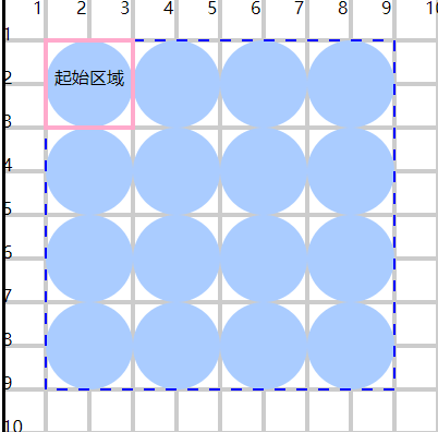
1.快速应用
<defs>
  <pattern id="pattern1" x="0" y="0" width=".25" height=".25">
    <circle cx="10" cy="10" r="10" fill="#acf" />
  </pattern>
</defs>

<rect x="10" y="10" width="80" height="80" fill="url(#pattern1)" stroke="#00f" stroke-width=".5" stroke-dasharray="2.5" />

<rect x="10" y="10" width="20" height="20" fill="none" stroke="#fac" />
<text x="20" y="20" font-size="4" text-anchor="middle">起始区域</text>
- x、y、width、height 计算图案的区域
- 默认根据区域大小进行平铺
- 在图案区域内设计具体的图案内容
2.单元系统
- 有2个单元系统属性
1)patternUnits 属性
- 用来设置图案区域的单元系统
- objectBoundingBox
- 默认值
- 值是百分比,参考的是目标图形
- userSpaceOnUse
- 参考坐标系
<defs>
  <pattern id="pattern2" x="40" y="40" width="20" height="20" patternUnits="userSpaceOnUse">
    <circle cx="10" cy="10" r="10" fill="#acf" />
  </pattern>
</defs>

<rect x="10" y="10" width="80" height="80" fill="url(#pattern2)" stroke="#00f" stroke-width=".5" stroke-dasharray="2.5" />

<rect x="40" y="40" width="20" height="20" fill="none" stroke="#fac" />
<text x="50" y="50" font-size="4" text-anchor="middle">起始区域</text>
2)patternContentUnits 属性
- 用来设置图案区域内部具体图形的单元系统
- userSpaceOnUse
- 默认值
- 使用具体的值
- objectBoundingBox
- 使用百分比
- 参考目标图形
相关信息
- 无论是哪一种单元系统,x 和 y 起始位置都是参考的团区域
- 使用百分比单元系统,在图形放大缩小时填充逻辑不变
<defs>
  <pattern id="pattern4" x="0" y="0" width=".25" height=".25" patternUnits="objectBoundingBox" patternContentUnits="objectBoundingBox">
    <circle cx=".125" cy=".125" r=".125" fill="#acf" />
  </pattern>
</defs>

<!-- 改变x y width height 的值,观察效果 -->
<rect x="20" y="20" width="40" height="40" fill="url(#pattern4)" stroke="#00f" stroke-width=".5" stroke-dasharray="2.5" />
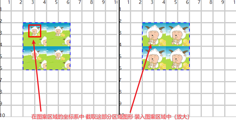
3.viewBox放缩
<defs>
  <pattern id="pattern7" viewBox="5 2 10 10" x="40" y="40" width="20" height="20" patternUnits="userSpaceOnUse" patternContentUnits="">
    <image href="../imgs/1.png" x="0" y="0" height="20" width="20" preserveAspectRatio="xMidYMid slice" />
  </pattern>
</defs>

<rect x="20" y="20" width="40" height="40" fill="url(#pattern7)" stroke="#00f" stroke-width=".5" stroke-dasharray="2.5" />
- 在图案区域中有一个坐标系,基于这个坐标,利用 viewbox 的 x、y、width、height 截取需要的部分
- 将其装载到图案区域中,基于 pattern.width 和 height 做放缩
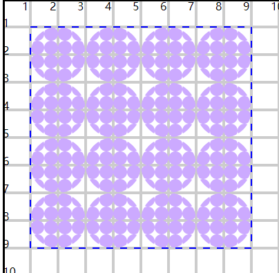
4.图案嵌套
- 在一个 pattern 图案中,可以嵌套引用另一个 pattern 图案
<defs>
  <pattern id="pattern82" x="0" y="0" width=".25" height=".25" patternUnits="objectBoundingBox" patternContentUnits="objectBoundingBox">
    <circle cx=".125" cy=".125" r=".125" fill="#caf" />
  </pattern>
  <pattern id="pattern81" x="0" y="0" width=".25" height=".25" patternUnits="objectBoundingBox" patternContentUnits="objectBoundingBox">
    <circle cx=".125" cy=".125" r=".125" fill="url(#pattern82)" />
  </pattern>
</defs>

<rect x="10" y="10" width="80" height="80" fill="url(#pattern81)" stroke="#00f" stroke-width=".5" stroke-dasharray="2.5" />
- 嵌套图案设计时的单元系统,参考的是外围图案的区域
(七)动画
- SVG动画支持 SMIL 规范,可以实现关键帧、移动图形、改变颜色等效果
- SVG动画可以实现一些CSS不容易实现的效果:路径动画、图形动画等
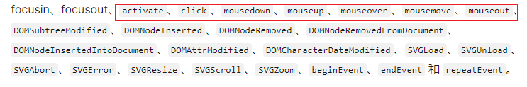
- 常用的动画标签:
<animate><animateTransform><animateMotion><set>
1.animate基础动画
<circle cx="30" cy="30" r="10" fill="#f00">
  <animate attributeType="XML" attributeName="cx" from="30" to="60" dur="1s" repeatCount="1" fill="freeze" />
</circle>
- 动画标签默认定义在图形标签内部,表示对当前图形进行动画设置
- 也可以单独定义动画标签,利用动画标签的 href属性 + 图形的id,为指定图形设置动画
<circle cx="30" cy="30" r="10" fill="#f00"></circle>

<circle id="c2" cx="30" cy="60" r="10" fill="#00f"></circle>

<animate href="#c2" ... />
- 可以使用多个动画标签,控制多个属性的动画变化
<circle cx="30" cy="30" r="10" fill="#f00">
  <animate attributeType="XML" attributeName="cx" from="30" to="60" dur="1s" repeatCount="1" fill="freeze" />

  <animate attributeType="XML" attributeName="cy" from="30" to="60" dur="1s" repeatCount="1" fill="freeze" />
</circle>
2.动画属性
1)attribute 控制动画属性
- attributeType
- 设置动画属性的类型,一般不建议设置,使用默认即可
- auto 默认
- CSS
- XML
- attributeName
- 设置具体的动画属性
- 支持SVG属性,也只是CSS属性
<animate attributeName="r" ...></animate>
2)from/to/by 控制动画数值
- 控制从哪个值到哪个值之间发生动画变化
- from 从哪个值开始
- 可以缺省,与图形的初始值相同
- to 到哪个值结束
- 是一个具体的值
- by 经过多少值
- 与 to 二选一
- 是一个相对的值
from 30 to 60   从 30 到 60
from 30 by 60   从 30 经过 60  [到90]
3)dur 控制动画时长
- 控制多久完成动画
- 可以是单一的时间单位:1s、100ms、1m
- 也可以是时间组合:1.500(1s + 500毫秒)、01:01.500(1min + 1s + 500ms)
4)repeatCount 控制动画次数
- 可以是一个具体的次数:1、2、3
- 可以是无限次:indefinite
5)repeatDur 控制动画总时长
- 在重复动画时,最大动画时长
- 如:1s完成一次动画,无限动画,但规定只会进行5s中的动画,相当于完成5次技术
6)fill 控制最终形态
- 控制动画执行完毕时,那一时刻的状态
- remove
- 默认值
- 移除动画最终的效果,从而恢复开始状态
- freeze
- 保留动画最终的效果
7)begin/end 控制动画起始
- 控制动画何时开始/结束
- 默认情况下是加载即开始,动画效果执行完毕即结束
a)控制动画延迟开始
begin="2s"2s后开始动画
b)控制动画在某一个图形事件后开始
- click、mouseover、mousedown、mouseout、mousemove
- 也可以是当前图形事件
begin="id.click"- 这里是是图形标签的id
<circle cx="30" cy="30" r="10" fill="#f00">
  <animate attributeName="cx" from="30" to="60" dur="1s" begin="btn2.mouseover" fill="freeze" />
</circle>

<g id="btn2" style="cursor:pointer">
  <rect x="40" y="60" width="20" height="10" rx="5" ry="5" fill="#ccc" stroke="#000" />
  <text x="50" y="67" font-size="6" text-anchor="middle">移入</text>
</g>
c)控制动画在某一个动画开始/结束时开始
begin="id.end"这里是动画标签的id
<rect x="20" y="20" width="0" height="10" fill="#f00">
  <animate id="a31" attributeType="XML" attributeName="width" to="20" dur="2s" begin="2s" fill="freeze" />
</rect>

<rect x="40" y="30" width="0" height="10" fill="#f00">
  <animate attributeType="XML" attributeName="width" to="20" dur="2s" begin="a31.end" fill="freeze" />
</rect>
d)可以控制多次动画的开始条件,多个条件使用分号分割
id="a41" begin="2s;a42.end"id="a42" begin="a41.end"- 死循环
e)控制某一个动画执行指定次数后,当前动画开始
begin="a51.repeat(2)"
<rect x="20" y="20" width="0" height="10" fill="#f00">
  <animate id="a51" attributeType="XML" attributeName="width" to="20" dur="2s" begin="2s" fill="freeze" repeatCount="3" />
</rect>

<rect x="40" y="30" width="0" height="10" fill="#f00">
  <animate attributeType="XML" attributeName="width" to="20" dur="2s" begin="a51.repeat(2)" fill="freeze" />
</rect>
f)end 与 begin有相同的控制特性
<rect x="20" y="20" width="0" height="10" fill="#f00">
  <animate id="a61" attributeType="XML" attributeName="width" to="20" dur="3s" fill="freeze" repeatCount="1" />
</rect>

<rect x="40" y="30" width="0" height="10" fill="#f00">
  <animate id="a61" attributeType="XML" attributeName="width" to="20" dur="1s" end="a61.end" fill="freeze" repeatCount="indefinite" />
</rect>
8)restart 控制重复动画
- always
- 默认值
- 任何时刻都允许重新开始动画
- whenNotActive
- 完成一次动画,才能开始下一次动画
- never
- 不能重复动画(只能执行一次)
9)values/keyTimes 控制动画过程
- 可以对动画过程拆分控制,每一段的运动默认都是 匀速 的
- values 提供过程中多个点的值,包含开始和结束
- from、to 和 by 失效
<circle cx="30" cy="30" r="10" fill="#f00">
  <animate attributeName="cx" values="30;90;30" dur="2s" fill="freeze" />
</circle>
- keyTimes 配合 values 使用
- 针对于 values 的分段,设置每一段的时长(百分比)
- 类似于CSS中的 @keyframes
<circle cx="30" cy="30" r="10" fill="#f00">
  <animate attributeName="cx" values="30;90;30" keyTimes="0;0.25;1" dur="4s" fill="freeze" />
</circle>
- 0-0.25的时间(1/4),完成30-90的运动(1s完成)
- 0.25-1的时间(3/4),完成90-30的运动(3s完成)
10)calcMode 控制运动速度
- 控制动画在(每一段)运动过程中的速度变化
- linear
- 默认,每一段都匀速
- 每一段的长短不同,彼此间速度不同
- paced
- 从始至终匀速,keyTimes无效
- discrete
- 直接跳跃到目标位置,没有中间的运动过程
- spline
- (三次贝塞尔)曲线型变化
- 可以实现先快后慢再快等效果
- 需要配合 keySplines 属性
11)keySplines 控制曲线速度
- 配合
calcMode="spline"实现每一段速度的贝塞尔曲线变化 - 使用的是三次贝塞尔曲线,所以需要设置两个控制点
- 每一段都有自己的贝塞尔设置,假设 values 提供了5个点,分成4段,需要提供4组控制点
- 每一组控制台都是 0-1 范围,在 0-1 坐标系中设计贝塞尔曲线的控制点
<svg viewBox="0 0 100 100" width="400" height="400">
  <circle cx="30" cy="30" r="10" fill="#f00">
    <animate attributeName="cx" values="30;90" calcMode="spline" keySplines="0 1 1 0" dur="4s" fill="freeze" />
  </circle>
</svg>

<svg viewBox="0 0 100 100" width="400" height="400">
  <path d="M0 0 L 100 100" fill="none" stroke="#fac" stroke-width="1" />
  <path d="M0 0 C0 50,100 50,100 100" fill="none" stroke="#F00" stroke-width="1" />
  <path d="M0 0 C0 100,100 0,100 100" fill="none" stroke="#0f0" stroke-width="1" />
  <path d="M0 0 C100 0,0 100,100 100" fill="none" stroke="#00f" stroke-width="1" />
</svg>
3.transform 变形动画
- 针对的是 transform 变化属性,包括旋转、平移、放缩、倾斜
1)使用 <animateTransform> 标签实现动画
- translate
- 可以设置一个值
(x, 0)或两个值(x, y) to="10 10"
- 可以设置一个值
- rotate
- 可以设置一个值
(角度, 0, 0)或三个值(角度, x, y) to="45 35 30"
- 可以设置一个值
- scale
- 可以设置一个值
(x, x)或两个值(x, y)
- 可以设置一个值
- skewX 和 skewY
<svg width="400" height="400" viewBox="0 0 100 100">
  <rect x="20" y="20" width="30" height="20" fill="#f00">
    <animateTransform attributeName="transform" attributeType="XML" type="translate" from="0" to="10 10" dur="1s" fill="freeze" />
  </rect>
</svg>

<svg width="400" height="400" viewBox="0 0 100 100">
  <rect x="20" y="20" width="30" height="20" fill="#f00">
    <animateTransform attributeName="transform" attributeType="XML" type="rotate(45)" from="0 35 30" to="45 35 30" dur="1s" fill="freeze" />
  </rect>
</svg>

<svg width="400" height="400" viewBox="-50 -50 100 100">
  <rect x="-15" y="-10" width="30" height="20" fill="#f00">
    <animateTransform attributeName="transform" attributeType="XML" type="scale" from="1" to="2" dur="1s" fill="freeze" />
  </rect>
</svg>

<svg width="400" height="400" viewBox="-50 -50 100 100">
  <rect x="-15" y="-10" width="30" height="20" fill="#f00">
    <animateTransform attributeName="transform" attributeType="XML" type="skewX" from="0" to="30" dur="1s" fill="freeze" />
  </rect>
</svg>
注意
- 当对图形进行多个变形动画时,可能会出现问题
- 后面动画执行时,会覆盖前面动画的最终效果(会恢复最初的状态,再动画)
- 可以使用
additive属性控制后面动画基于前面动画的效果上进行
2)扩展属性:additive 效果累加
- 对图形进行多个变形动画时,控制动画效果之间的关系
- replace
- 默认值
- 新动画效果覆盖原动画效果(恢复初始状态再动画)
- sum
- 新动画效果会在原动画效果基础上累加
<rect x="-10" y="-10" width="20" height="20" fill="#f00">
  <animateTransform id="a1" attributeName="transform" attributeType="XML" type="scale" from="1" to="2" dur="1s" fill="freeze" />

  <animateTransform
    attributeName="transform"
    attributeType="XML"
    type="rotate"
    from="0"
    to="45"
    begin="a1.end"
    additive="sum"
    dur="1s"
    fill="freeze"
  />
</rect>
3)扩展属性:accumulate 效果累加
- 针对于图形的一个动画,多次执行时,控制后一次的效果是否是基于前一次的动画效果
- 相对值效果明显
<rect x="20" y="20" width="20" height="20" fill="#f00">
  <animate attributeType="XML" attributeName="x" by="20" dur="1s" accumulate="sum" fill="freeze" repeatCount="3" />
</rect>
4.motion 路径动画
<path d="M20 50 A30 30 0 0 1 80 50A30 30 0 0 1 20 50" fill="none" stroke="#00f" />

<circle cx="0" cy="0" r="3" fill="#f00" fill-opacity="0.8">
  <animateMotion path="M20 50 A30 30 0 0 1 80 50A30 30 0 0 1 20 50" dur="2s" fill="freeze"></animateMotion>
</circle>
1)path 属性与 path 标签的 d 属性有相同编写规范
2)使用 keyPoints 属性为路径分段
- 可以分别控制每一段的速度
- 使用比例进行分段
<svg width="400" height="400" viewBox="0 0 100 100">
  <path d="M0 0 L100 100" fill="none" stroke="#00f" />

  <circle cx="0" cy="0" r="3" fill="#f00" fill-opacity="0.8">
    <animateMotion path="M0 0 L100 100" begin="1s" dur="2s" fill="freeze"></animateMotion>
  </circle>
</svg>

<svg width="400" height="400" viewBox="0 0 100 100">
  <path d="M0 0 C0 100 100 0 100 100" fill="none" stroke="#00f" />

  <circle cx="0" cy="0" r="3" fill="#f00" fill-opacity="0.8">
    <animateMotion
      path="M0 0 C0 100 100 0 100 100"
      keyPoints="0;1"
      keyTimes="0;1"
      calcMode="spline"
      keySplines="0 1 1 0"
      begin="1s"
      dur="2s"
      fill="freeze"
    ></animateMotion>
  </circle>
</svg>

<svg width="400" height="400" viewBox="0 0 100 100">
  <path d="M0 0 C100 0 0 100 100 100" fill="none" stroke="#00f" />

  <circle cx="0" cy="0" r="3" fill="#f00" fill-opacity="0.8">
    <animateMotion
      path="M0 0 C100 0 0 100 100 100"
      keyPoints="0;1"
      keyTimes="0;1"
      calcMode="spline"
      keySplines="1 0 0 1"
      begin="1s"
      dur="2s"
      fill="freeze"
    ></animateMotion>
  </circle>
</svg>
3)rotate属性
- 控制图形在沿着路径运动过程中,保持与路径相同的角度
- auto
- 正向保持角度
- auto-reverse
- 反向保持角度
<path d="M20 50 A30 30 0 0 1 80 50A30 30 0 0 1 20 50" fill="none" stroke="#00f" />

<rect x="0" y="0" width="5" height="5" fill="#f00" fill-opacity="0.8">
  <animateMotion path="M20 50 A30 30 0 0 1 80 50A30 30 0 0 1 20 50" rotate="auto" dur="4s" fill="freeze"></animateMotion>
</rect>
4)扩展:mpath 子标签
- 引用一个 path 图形作为当前图像的运动路径
- 更推荐使用 mpath,不建议直接使用 path 属性
<path id="d1" d="M20 50 A30 30 0 0 1 80 50 L50 90 Z" fill="none" stroke="#00f" />

<rect x="0" y="0" width="5" height="5" fill="#f00" fill-opacity="0.8">
  <animateMotion rotate="auto-reverse" dur="4s" fill="freeze">
    <mpath href="#d1" />
  </animateMotion>
</rect>
5.set 设置变化
- 设置属性,使得图形发生一些变化,但没有变化过程
- 支持所有的属性类型(字符串、布尔等)
1)使用动画的一些属性
- to
- 设置具体的属性值
- begin
- 设置开始时间点
- dur
- 属性保持时间
- attributeName
- 属性名
<path fill="none" stroke="#00f" stroke-width="1">
  <set id="s1" attributeName="d" to="M30 30h40 v40 h-40 z" dur="1s" begin="0;s3.end" />
  <set id="s2" attributeName="d" to="M30 50 A20 20 0 0 1 70 50A 20 20 0 0 1 30 50" dur="1s" begin="s1.end" />
  <set id="s3" attributeName="d" to="M50 30 L30 70 L 70 70 Z" dur="1s" begin="s2.end" />
</path>
(八)滤镜
1.基本应用
- 使用
<filter>标签定义滤镜(容器),可以包含多个具体的滤镜(原语) - 图形使用
filter属性引用滤镜
<defs>
  <filter id="f1">
    <feGaussianBlur in="SourceGraphic" stdDeviation="2" result="r1" />
    <feOffset dx="2" dy="2" result="r1" />
    <feMerge>
      <feMergeNode in="r1" />
      <feMergeNode in="SourceGraphic" />
    </feMerge>
  </filter>
</defs>

<rect x="10" y="10" width="50" height="40" fill="#f00" filter="url(#f1)" />
1)filter 基本属性
- id
- 唯一标识滤镜,方便图形引用
- x、y、width、height
- 控制滤镜的作用范围
- 默认
x = y = -10%、width = height = 120%
- filterUnits
- 设置filter区域的数据单元
- objectBoundingBox
- 默认值
- 百分比,基于图形
- userSpaceOnUse
- 具体值
- 基于坐标系
- primitiveUnits
- 设置filter容器内部具体滤镜区域的数据单元
- userSpaceOnUse
- 默认值
- objectBoundingBox
2)filter容器内部多个滤镜的生效过程
- 当某一个滤镜作用在图形上不会立刻生效,而是会将处理结果存入缓存
- 可以使用result属性定义缓存名称
- 下一个滤镜可以使用
in(in2)属性将缓存中的结果加入到当前滤镜处理中
<feGaussianBlur in="SourceGraphic" stdDeviation="2" result="r1" />
<feOffset in="r1" dx="2" dy="2" result="r1" />
- 如果没有对装入缓存的结果命名,下一个滤镜会默认装载上一个紧邻的处理结果
- 也可以使用in属性,指定对原图片做处理
in="SourceGraphic"
3)可以使用 svg 和 css 的方式使得滤镜生效
<rect filter="url(#f1)"></rect>
rect {
  filter: url(#f1);
}
2.shadow 阴影滤镜
1)使用 <feDropShadow> 标签实现阴影
- dx、dy
- 横向和纵向的偏移
- stdDeviation
- 设置模糊程度,值越大,越模糊
- 默认是黑色阴影
<defs>
  <filter id="f1">
    <feDropShadow dx="1" dy="1" stdDeviation="2"></feDropShadow>
  </filter>
</defs>

<rect x="20" y="20" width="50" height="40" fill="#f00" filter="url(#f1)" />
2)使用 flood-color 和 flood-opacity 设置阴影的颜色和透明度
<defs>
  <filter id="f2">
    <feDropShadow dx="2" dy="2" stdDeviation="1" flood-color="#f00" flood-opacity="0.8"></feDropShadow>
  </filter>
</defs>

<rect x="20" y="20" width="50" height="40" fill="#f00" filter="url(#f2)" />
3.blur 模糊滤镜
1)使用 <feGaussianBlur> 标签设置模糊效果
<defs>
  <filter id="f1">
    <feGaussianBlur in="SourceGraphic" stdDeviation="2" />
  </filter>
</defs>

<image xlink:href="../imgs/5.png" x="0" y="0" height="100" width="100" filter="url(#f1)" />
- stdDeviation
- 设置模糊程度
- in
- 设置输入源(对谁模糊)
- SourceGraphic
- 对作用的图像模糊
- SourceAlpha
- 基于作用图像的透明度实现模糊(黑色效果)
相关信息
- 没有指定in
- 滤镜在最开始,此时默认针对的就是作用的图像模糊
- 滤镜在中间,对上一个滤镜效果做模糊
2)可以使用 x、y、width、height 设置模糊区域
- 只对图形的一部分做模糊(其他部分不可见)
<defs>
  <filter id="f3">
    <feGaussianBlur stdDeviation="3" x="30" y="0" width="50" height="40" result="r3" />
    <feMerge>
      <feMergeNode in="SourceGraphic"></feMergeNode>
      <feMergeNode in="r3"></feMergeNode>
    </feMerge>
  </filter>
</defs>
<image xlink:href="../imgs/5.png" x="0" y="0" height="100" width="100" filter="url(#f3)" />
4.offset 位移滤镜
- 使用
<feOffset>标签实现偏移效果
<defs>
  <filter id="f1">
    <feGaussianBlur in="SourceGraphic" stdDeviation="2" />
    <feOffset dx="2" dy="2" result="r1" />

    <feGaussianBlur in="SourceGraphic" stdDeviation="2" />
    <feOffset dx="-2" dy="2" result="r2" />
    <feMerge>
      <feMergeNode in="r1" />
      <feMergeNode in="r2" />
      <feMergeNode in="SourceGraphic" />
    </feMerge>
  </filter>
</defs>

<circle cx="50" cy="50" r="20" fill="#f00" filter="url(#f1)" />
- dx 和 dy
- 设置横纵的偏移
- result
- 为滤镜效果缓存命名,方便后面引用
- 可以对一个对象进行多次滤镜效果,可以对多个效果组合应用
5.merge 合并滤镜
- 使用
<feMerge>标签和<feMergeNode>子标签完成多个滤镜效果的合并使用 - 默认多个滤镜效果只能按顺序生效
- 可以通过合并滤镜,让两个滤镜独立组合,根据需求控制顺序
6.blend 混合滤镜
- 将多个滤镜效果合并在一起,并彼此产生一个颜色变化(化学反应)
- 使用
<feBlend>标签实现混合效果
<defs>
  <filter id="f1">
    <feImage href="../imgs/4.png" width="120" height="120" preserveAspectRatio="xMidYMid slice" result="img" />
    <feBlend in="SourceGraphic" in2="img" mode="normarl" />
  </filter>
</defs>

<image href="../imgs/3.png" x="0" y="0" height="100" width="100" preserveAspectRatio="xMidYMid slice" filter="url(#f1)" />
- in
- 设置上面的输入源
- in2
- 设置下面的输入源
- mode
- 设置两个输入源混合状态
1)normal
- 按顺序,谁在上显示谁
2)multiply
- 两个输入源颜色相乘
- 黑色叠加就偏黑,白色叠加偏原色
- 整体偏黑色图片
3)screen
- 两个输入源颜色反转相乘
- 黑色叠加偏原色,白色叠加偏白色
- 整体偏白色图片
4)darken
- 两个输入源,每个像素的颜色,谁暗就用谁
5)lighten
- 两个输入源,每个像素的颜色,谁亮就用谁
- 与 screen 有些相似,与选图有关,使劲看还是有差异的
更多混合效果参考css手册。
7.composite 合成滤镜
- 将两个图形合成一个图形,针对图形的形状
- 使用
<feComposite>标签实现合成效果
<defs>
  <filter id="f1" x="0" y="0">
    <feImage href="../imgs/5.png" width="100" height="100" result="img" />
    <feComposite in="img" in2="SourceGraphic" operator="over" />
  </filter>
</defs>

<circle cx="50" cy="50" r="50" fill="#fac" filter="url(#f1)" />
- in(上)和 in2(下)输入两个带合成的图形
- operator 控制合成效果
1)over
- 默认值
- in 在 in2 的上面
- in 是图片
2)in
- 显示 in 与 in2 图形重叠的部分,使用上层(in)图形的色彩
- in 是原图形
3)out
- 显示 in 与 in2 图形不重叠的部分,使用上层(in)图形的色彩
- in 是原图形
4)atop
- 显示 in 与 in2 重叠的部分和 in2 与 in 未重叠的部分(in 在 in2 上面的部分)
- in 是原图形
5)xor
- 显示两个图形不重叠的部分
6)lighter
- 两个图形都会显示,印在一起
- in 是原图形
7)arithmetic
- 两个图形的显示由计算得出,需要配合 k1、k2、k3、k4 四个属性
- 合成计算公式:
c = k1*i1*i2 + k2*i1 + k3+i2 + k4- k1:两个图形的像素值会影响计算结果
- k2:in 图形的像素值会影响计算结果
- k3:in2 图形的像素值会影响计算结果
- k4:偏移量,影响整体(亮暗)
- 1:最亮,全白
- -1:最暗,看不到
8.matrix 色彩矩阵滤镜
- 使用
<feColorMatrix>标签实现色彩转换效果 - 机制就是利用一个转换矩阵进行计算,实现色彩变化,控制亮度、饱和度、对比度、灰度等效果,从而增强视觉感受
- 每一个像素的色彩由 RGBA 四部分组成,需要提供 4*5 列矩阵,按照如下公式计算获得新的色彩
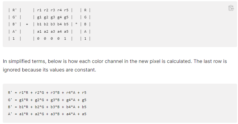
- 色彩在转换过程中,都会变成
[0, 1]在计算的 - 所以第五列偏移量,1表示255,-1表示-255
解析(红色为例)
NEW_R = R * r1 + G * r2 + B * r3 + A * r4 + r5- r1:会影响所有的红色数值
- r2:含有的绿色会影响红色数值
rgb(100, 10, 0) - r3:含有的蓝色会影响红色数值
- r4:含有的透明度会影响红色数值
- r5:偏移量,按需影响红色
1)matrix 转换
<defs>
  <filter id="f2">
    <feColorMatrix
      in="SourceGraphic"
      type="matrix"
      values="
                                -1 3 -1 0 0
                                0 1 0 0 0
                                0 0 1 0 0
                                0 0 0 1 0"
    />
  </filter>
</defs>

<image filter="url(#f2)" href="../imgs/6.png" x="0" y="0" height="60" width="60" />
<image href="../imgs/6.png" x="0" y="0" height="60" width="60" transform="translate(0,50)" />
- RGB等比例增减,可以影响对比度
- 都从 1 - 1.5,对比度明显
- RGB增减偏移量,影响亮度
- RGB值保留一个通道,影响灰度
2)saturate 调整饱和度
- 1-0
- 饱和度降低,变灰
- 1-n
- 饱和度增加,变鲜艳
<defs>
  <filter id="f5">
    <feColorMatrix in="SourceGraphic" type="saturate" values="1.5" />
  </filter>
</defs>

<image filter="url(#f5)" href="../imgs/6.png" x="0" y="0" height="60" width="60" />
<image href="../imgs/6.png" x="0" y="0" height="60" width="60" transform="translate(0,50)" />
3)hueRotate 调整色相盘
- 改变色调,0-360°
<defs>
  <filter id="f6">
    <feColorMatrix in="SourceGraphic" type="hueRotate" values="180" />
  </filter>
</defs>

<image filter="url(#f6)" href="../imgs/6.png" x="0" y="0" height="60" width="60" />
<image href="../imgs/6.png" x="0" y="0" height="60" width="60" transform="translate(0,50)" />
4)luminanceToAlpha 根据图像自身亮度转换成透明度
- 越亮越可见,越暗越透明
- value 属性无效
- 可用来创建投影,剪影等效果
<defs>
  <filter id="f7">
    <feColorMatrix in="SourceGraphic" type="luminanceToAlpha" />
  </filter>
</defs>

<image filter="url(#f7)" href="../imgs/6.png" x="0" y="0" height="60" width="60" />
<image href="../imgs/6.png" x="0" y="0" height="60" width="60" transform="translate(0,50)" />
9.transfer 颜色通道滤镜
- 可以针对于每一个颜色通道实现色彩变化处理
- 每一个通道都通过不同的变换函数来实现色彩处理
- 这些函数可以实现非线性的颜色处理
- 可以操作亮度、对比度、色彩平衡、色调等效果
- 与 matrix 相比,更复杂、更高级、更灵活
- 使用
<feComponentTransfer>标签实现通道转换效果 - 使用
<feFuncR> <feFuncG> <feFuncB> <feFuncA>四个子标签分别针对于每一个通道进行一个函数转换处理 - 设置
<feFuncR>标签的type属性来使用不同的转换函数- identity:不转换
- linear:线性转换
- gamma:伽马转换
- table:映射转换
- discrete:(离散)映射转换
1)linear 线性转换
- 需要配合 slope 和 intercept 属性
new_r = slope * r + intercept- slope 影响对比度
- intercept 影响亮度
<defs>
  <filter id="f1">
    <feComponentTransfer in="SourceGraphic">
      <!-- new_r = slope * r + intercept -->
      <feFuncR type="linear" slope="2" intercept="0"></feFuncR>
      <feFuncG type="linear" slope="1" intercept=".5"></feFuncG>
    </feComponentTransfer>
  </filter>
</defs>

<rect x="20" y="20" width="40" height="30" fill="rgba(178,0,0,1)" filter="url(#f1)" />
<rect x="20" y="60" width="40" height="30" fill="rgba(178,0,0,1)" />
2)gamma 非线性转换
- 需要配合 amplitude、exponent、offset 三个属性
new_r = amplitude * pow(r,exponent) + offset
<defs>
  <filter id="f4">
    <feComponentTransfer in="SourceGraphic">
      <!-- new_r = amplitude * pow(r,exponent) + offset -->
      <feFuncR type="gamma" amplitude="1" exponent=".5" offset="0"></feFuncR>
    </feComponentTransfer>
  </filter>
</defs>

<g filter="url(#f4)">
  <rect x="20" y="20" width="20" height="20" fill="rgb(100,0,0)" />
  <rect x="40" y="20" width="20" height="20" fill="rgb(200,0,0)" />
</g>

<g transform="translate(0,30)">
  <rect x="20" y="20" width="20" height="20" fill="rgb(100,0,0)" />
  <rect x="40" y="20" width="20" height="20" fill="rgb(200,0,0)" />
</g>
- 颜色在计算时,会从 [0, 255] 区间,转换至 [0, 1] 区间再计算,所以颜色一般都小数
- 指数越大,结果越小,颜色越暗
- 指数越小,结果越大,颜色越亮
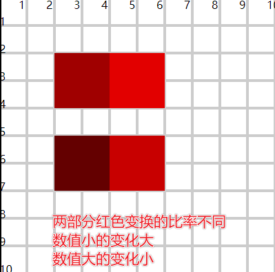
3)table 区间映射
- 将原区间上的颜色,映射到新的区间中
- 配合 tableValues 属性
a)解析
- tablesValue可以提供一组
[0, 1]数值:0 0.2 1 - 3个数值,可以将颜色区间分成2段
- 这里存在两组区间
- 默认颜色区间:
[0, 0.5]、[0.5, 1] - 映射颜色区间:
[0, 0.2]、[0.2, 1]
- 默认颜色区间:
- 当前颜色 r = 0.4
- 其在默认区间中属于第一段
[0, 0.5],映射时对应的也是第一段的映射区间[0, 0.2] - 在默认区间中,找到 0.4 对应的位置,从而在映射区间中也找到相同的位置,即为映射后的颜色
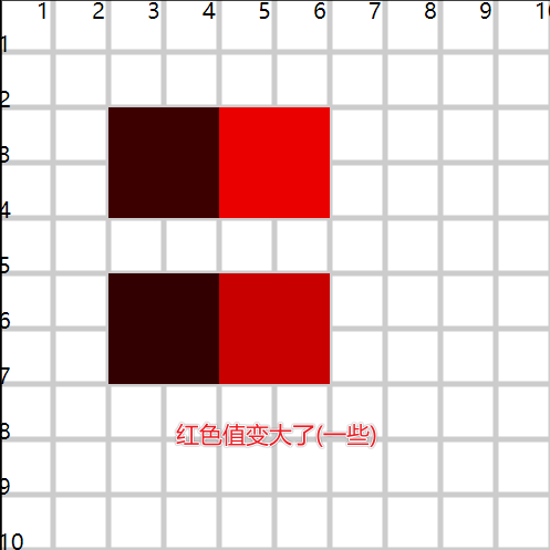
tableValues = "0 0.8 0.9 1"- 4个数值,可以将颜色区间分成3段
- 默认颜色区间:
[0, 0.33)、[0.33, 0.66]、[0.66, 1] - 映射区间:
[0, 0.8]、[0.8, 0.9]、[0.9, 1]
- 默认颜色区间:
r = 0.166- 属于第一段区间,算出位置,找到第一段映射区间的位置 0.4
<defs>
  <filter id="f5">
    <feComponentTransfer in="SourceGraphic">
      <feFuncR type="table" tableValues="0 0.8 1"></feFuncR>
    </feComponentTransfer>
  </filter>
</defs>

<g filter="url(#f5)">
  <rect x="20" y="20" width="20" height="20" fill="rgb(50,0,0)" />
  <rect x="40" y="20" width="20" height="20" fill="rgb(200,0,0)" />
</g>

<g transform="translate(0,30)">
  <rect x="20" y="20" width="20" height="20" fill="rgb(50,0,0)" />
  <rect x="40" y="20" width="20" height="20" fill="rgb(200,0,0)" />
</g>
- 颜色是
(0, 255)区间段,最多可以提供256个映射的值,相当于为每一个颜色值都提供了对应的映射- 默认区间:0, 1, 2, ..., 243, 254, 255
- 映射区间:2, 3, 4, ..., 255, 256, 257
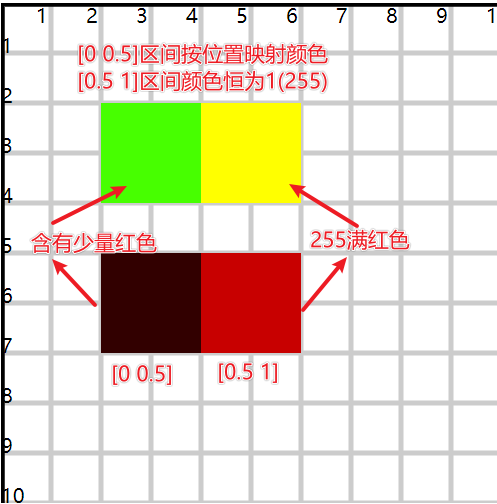
映射区间的多个数值不是必须递增的
tableValues = "1 1"- 原区间:
[0, 1] - 映射区间:
[1, 1] - 无论原来的颜色是什么,映射后都是1
<defs>
  <filter id="f6">
    <feComponentTransfer in="SourceGraphic">
      <feFuncR type="table" tableValues="0 1 1"></feFuncR>
      <feFuncG type="table" tableValues="1 1"></feFuncG>
    </feComponentTransfer>
  </filter>
</defs>

<g filter="url(#f6)">
  <rect x="20" y="20" width="20" height="20" fill="rgb(50,0,0)" />
  <rect x="40" y="20" width="20" height="20" fill="rgb(200,0,0)" />
</g>

<g transform="translate(0,30)">
  <rect x="20" y="20" width="20" height="20" fill="rgb(50,0,0)" />
  <rect x="40" y="20" width="20" height="20" fill="rgb(200,0,0)" />
</g>
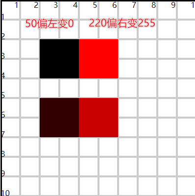
4)discrete (离散)映射转换
- 配合 tableValues 属性
a)解析
tableValues="0 0.5 1"type="table"- 3个数值对应2个段
type="discrete"- 3个数值对应3个点,理解成对应3个段
[0, 0]、[0.5, 0.5]、[1, 1]
- 默认区间:
[0, 0.33]、[0.33, 0.66]、[0.66, 1] - 映射区间(点):
0 0.5 1
<defs>
  <filter id="f7">
    <feComponentTransfer in="SourceGraphic">
      <feFuncR type="discrete" tableValues="0 1"></feFuncR>
    </feComponentTransfer>
  </filter>
</defs>

<g filter="url(#f7)">
  <rect x="20" y="20" width="20" height="20" fill="rgb(50,0,0)" />
  <rect x="40" y="20" width="20" height="20" fill="rgb(220,0,0)" />
</g>

<g transform="translate(0,30)">
  <rect x="20" y="20" width="20" height="20" fill="rgb(50,0,0)" />
  <rect x="40" y="20" width="20" height="20" fill="rgb(220,0,0)" />
</g>
10.morphology 形态滤镜
- 实现图像的腐蚀和扩展
- 图像可以是文字也可以是图形
- 文字体现粗细
- 图形体现大小
- 常见的是不规则图形设置描边
1)使用 <feMorphology> 标签实现效果
- operator
- 设置形态类型
- erode:腐蚀
- dilate:扩张
- radius
- 设置变形程度
<defs>
  <filter id="f11">
    <feMorphology operator="erode" radius=".2" />
  </filter>

  <filter id="f12">
    <feMorphology operator="erode" radius=".5" />
  </filter>
</defs>

<text x="20" y="20">dmc</text>
<text x="20" y="50" filter="url(#f11)">dmc</text>
<text x="20" y="80" filter="url(#f12)">dmc</text>
相关信息
- 内部有腐蚀和扩张的算法,所以效果并不是单纯的变细或变小
- https://www.w3.org/TR/SVG11/filters.html#feMorphologyElement
2)使用形态滤镜实现不规则图形的描边
<defs>
  <filter id="f4">
    <feMorphology in="SourceGraphic" operator="dilate" radius="2" result="img1" />
    <feFlood flood-color="#f00" flood-opacity="1" result="img2" />
    <feComposite in="img2" in2="img1" operator="in" result="img3" />
    <feMerge>
      <feMergeNode in="img3" />
      <feMergeNode in="SourceGraphic" />
    </feMerge>
  </filter>
</defs>

<image xlink:href="../imgs/7.png" x="10" y="10" height="80" width="80" filter="url(#f4)" />
3)扩展:flood滤镜
- 用于将整个图像填充为单个颜色
- flood-color:设置颜色
- flood-opacity:设置透明度
- 经常用来配合其他滤镜
- 也支持 x、y、width、height 控制填充区域大小
11. map 位移映射滤镜
- 可以创建水波、涟漪、扭曲等视觉效果
- 使用
<feDisplacementMap>标签实现效果
1)实现原理
- 将A图像的内容放置到B图像的空间中,将A图像的每一个像素值映射到B图像空间(最终显示A图像的内容)
- 在这个映射过程中,会遵循指定的位移公式(关系)
P(x + scale * (XC(x,y) - 0.5), y + scale * (YC(x,y) - 0.5)) -> P'(x,y)- P(x,y)
- A图像的坐标位置
- P'(x,y)
- B图像的坐标位置
- scale
- 位移比例,比例值越大,位移效果越明显
- XC(x,y)
- 当前位置的像素在x轴位移时,使用的B图像对应位置的RGBA(之一)通道值来进行位移计算
- 通道值在计算时会转换成
[0, 1]区间再计算
- YC(x,y)
- 当前位置的像素在y轴位移时,使用的B图像对应位置的RGBA(之一)通道值来进行位移计算
- -0.5
- 计算常量
- P(x,y)
2)案例
- 设置
x = 0y = 0- 此时不是
P(0, 0)和P'(0, 0)
- 此时不是
scale = 20- B图像
(0, 0)位置RGBA通道值(255, 0, 0, 0.5) XC = R(255)YC = A(0.5)P(0 + 20 * (1-0.5), 0 + 20 * (0.5 - 0.5)) -> P'(0 ,0)P(10, 0) -> P'(0, 0)- 将A图像
(10, 0)位置的像素值在B图像(0, 0)位置显示
<!-- 10.svg -->
<svg xmlns="http://www.w3.org/2000/svg" viewBox="0 0 20 20" width="400" height="400">
  <rect x="10" y="0" width="1" height="1" fill="#00f" />
</svg>
<!-- 10.html -->
<svg width="400" height="400" viewBox="0 0 20 20" style="border:solid #000;">
  <defs>
    <filter id="f1">
      <feImage href="10.svg" x="0" y="0" height="20" width="20" result="img1" />
      <feDisplacementMap in="img1" in2="SourceGraphic" scale="20" xChannelSelector="R" yChannelSelector="A"></feDisplacementMap>
    </filter>
  </defs>

  <rect x="0" y="0" width="20" height="20" fill="rgba(255,0,0,0.5)" filter="url(#f1)" />
  <image xlink:href="10.svg" x="0" y="0" height="20" width="20" />
</svg>
- in
- 输入图像,A图像,最终要展示的图像
- in2
- 目标图像,B图像,用来提供映射通道的图像
- xChannelSelector
- 可选值RGBA之一,选择指定通道值
[0, 1]作为x轴映射的计算值
- 可选值RGBA之一,选择指定通道值
- yChannelSelector
- 可选值RGBA之一, 选择指定通道值
[0, 1]作为y轴映射的计算值
- 可选值RGBA之一, 选择指定通道值
- scale
- 映射比例
<defs>
  <filter id="f3">
    <feImage href="../imgs/6.png" x="0" y="0" height="100" width="100" result="img1" />
    <feDisplacementMap in="img1" in2="SourceGraphic" scale="20" xChannelSelector="A" yChannelSelector="R"></feDisplacementMap>
  </filter>
</defs>

<g filter="url(#f3)">
  <rect x="0" y="0" width="25" height="100" fill="rgba(255,0,0.5)" />
  <rect x="25" y="0" width="25" height="100" fill="rgba(0,0,0,0.5)" />
  <rect x="50" y="0" width="25" height="100" fill="rgba(255,0,0.5)" />
  <rect x="75" y="0" width="25" height="100" fill="rgba(0,0,0,0.5)" />
  <rect x="100" y="0" width="25" height="100" fill="rgba(255,0,0.5)" />
</g>
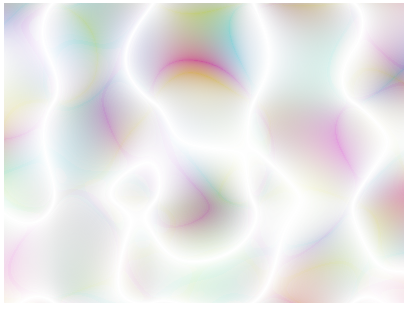
12.turbulence 湍流滤镜
- 利用噪声函数,创建半透明或波状图形
- 例如人造纹理
1)使用 <feTurbulence> 标签实现效果
- 不需要原图
- 直接创建波纹将其作用在原图上
<defs>
  <filter id="f1" x="0" y="0" width="1" height="1">
    <feTurbulence baseFrequency="0.05" />
  </filter>
</defs>

<rect x="10" y="20" width="80" height="60" fill="#ff0" filter="url(#f1)" />
- baseFrequency
- 设置波纹图形区域的大小
- 频率越小,图形越大
- 频率越大,图形越小越精细
- 通常取值
0.02 ~ 0.2
- numOctaves
- 设置噪声的精细度
- 值越大,噪声更详细
- 默认值1
- 值越大,会有更高的运算,影响性能
- seed
- 可以生成不同形状的条纹
- type
- turbulence
- 形状混乱,表现为随机、不可预测的、紊乱的效果
- 形状尖锐,形似湍流
- fractalNoise
- 分形噪声更加平缓
- 带有模糊效果
- turbulence
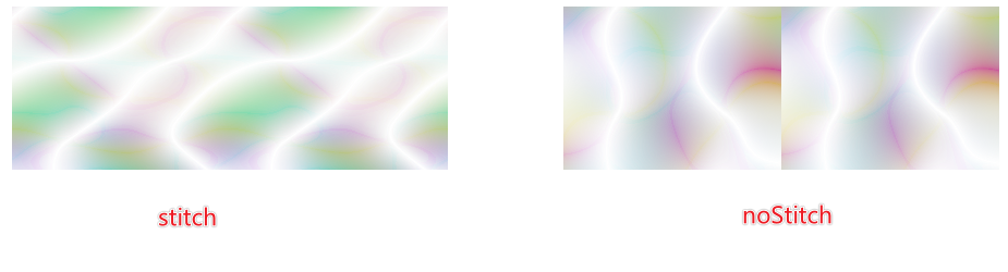
- stitchTiles
2)stitchTiles 属性
- 当两块使用湍流滤镜的图形拼接在一起时,控制拼接缝处的湍流效果
- noStitch
- 默认值
- 两个区域在视觉效果上是独立的
- stitch
- 两个区域在视觉效果上是联通的,如同一个区域一样
- noStitch
<defs>
  <filter id="f2" x="0" y="0" width="1" height="1">
    <feTurbulence baseFrequency="0.05" numOctaves="1" seed="1" type="turbulence" stitchTiles="stitch"></feTurbulence>
  </filter>
</defs>

<rect x="10" y="20" width="40" height="30" fill="#ff0" filter="url(#f2)" />
<rect x="10" y="20" width="40" height="30" fill="#ff0" filter="url(#f2)" transform="translate(40,0)" />
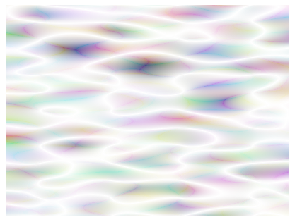
3)baseFrequency 属性
- 设置波纹区域时,可以有 x 和 y 两个值的设置
- 当设置一个值的时候,x 和 y 相等
- 可以设置 x 和 y 不同的比例,拉伸噪声区域,创建上水流波纹
<defs>
  <filter id="f4" x="0" y="0" width="1" height="1">
    <feTurbulence baseFrequency="0.05 0.2" numOctaves="1" seed="1" type="turbulence"></feTurbulence>
  </filter>
</defs>

<rect x="10" y="20" width="80" height="60" fill="#ff0" filter="url(#f4)" />
13.滤镜与动画
1)模糊动画
2)色彩矩阵转换动画
3)文字+湍流动画
4)图形+湍流动画
- 实现水波流动
5)图形+位移映射
- 实现图像涟漪
(九)Snap 库
- 是一个 SVG 的 API库
- 提供了更简单的方法来创建、操作动画 SVG 图形
1.下载并引入
<script src="snap.svg.js"></script>
2.创建画布 Pager
- 相当于创建了一个svg标签
- 会产生一个Pager对象
// 创建pager对象,并在body中创建一个svg标签
const pager = Snap(width, height);
// 创建pager对象,关联body中已有的一个svg标签
const pager = Snap(selector);
3.绘制图形
- 在画布中绘制图形(圆、椭圆、线、折线、多边形、矩形、path、渐变、filter)
- 使用的是Pager对象相关的API
- 创建的每一个图形都是Element对象
- 可以使用Element的API进一步操作设置图形元素
const element = pager.rect(50, 50, 100, 50);
4.设置图形元素
- 每一个图形都是Element元素对象
- 可以使用Element的API进一步操作和设置图形
- 如:属性、动画、渐变、滤镜、事件
element.attr({
  fill: "#fac",
  stroke: "#ccc",
  strokeWidth: 5,
  transform: "rotate(45,75,100)",
});
相关信息
pager也可以使用 attr() 函数,设置 SVG 的属性
5.设置图形动画
- 使用
element.animate()
circle.click((e) => {
  circle.animate({ r: 30, cx: 60 }, 1000, function () {
    this.animate({ r: 10, cx: 50 }, 1000);
  });
});
- 对path的d属性,也可以使用animate动画函数,并且有动画变化的过程
- 过程不可控
const svg2 = Snap("#svg2");
svg2.attr({
  width: 400,
  height: 400,
  viewBox: "0 0 100 100",
});

const path = svg2.path("M20 50 H 80");
path.attr({
  fill: "none",
  stroke: "#00f",
  strokeWidth: 2,
});
path.animate({ d: "M20 50 A20 20 0 0 1 80 50A20 20 0 0 1 20 50 " }, 1000);
6.Snap 静态方法
- Snap除了使用工厂函数以外,还提供了许多的静态方法(工具方法)
1)Snap.sin(角度)
- 直接对 角度 进行计算
- 与
Math.sin()不同,支持的是弧度
// snap库的三角函数计算
Snap.sin(90) == 1;

// Math的三角函数计算,需要将角度转换成弧度才能计算
Math.sin((90 * Math.PI) / 180) == 1;
2)Snap.deg(rad)
- 弧度转角度
3)Snap.rad(deg)
- 角度转弧度